
In-house brand & performance design / Pet nutrition
Pupford
Photography, packaging, landing pages, paid social and an illustrated cast of pups — the day-to-day design engine behind a direct-to-consumer dog food and training treat brand.
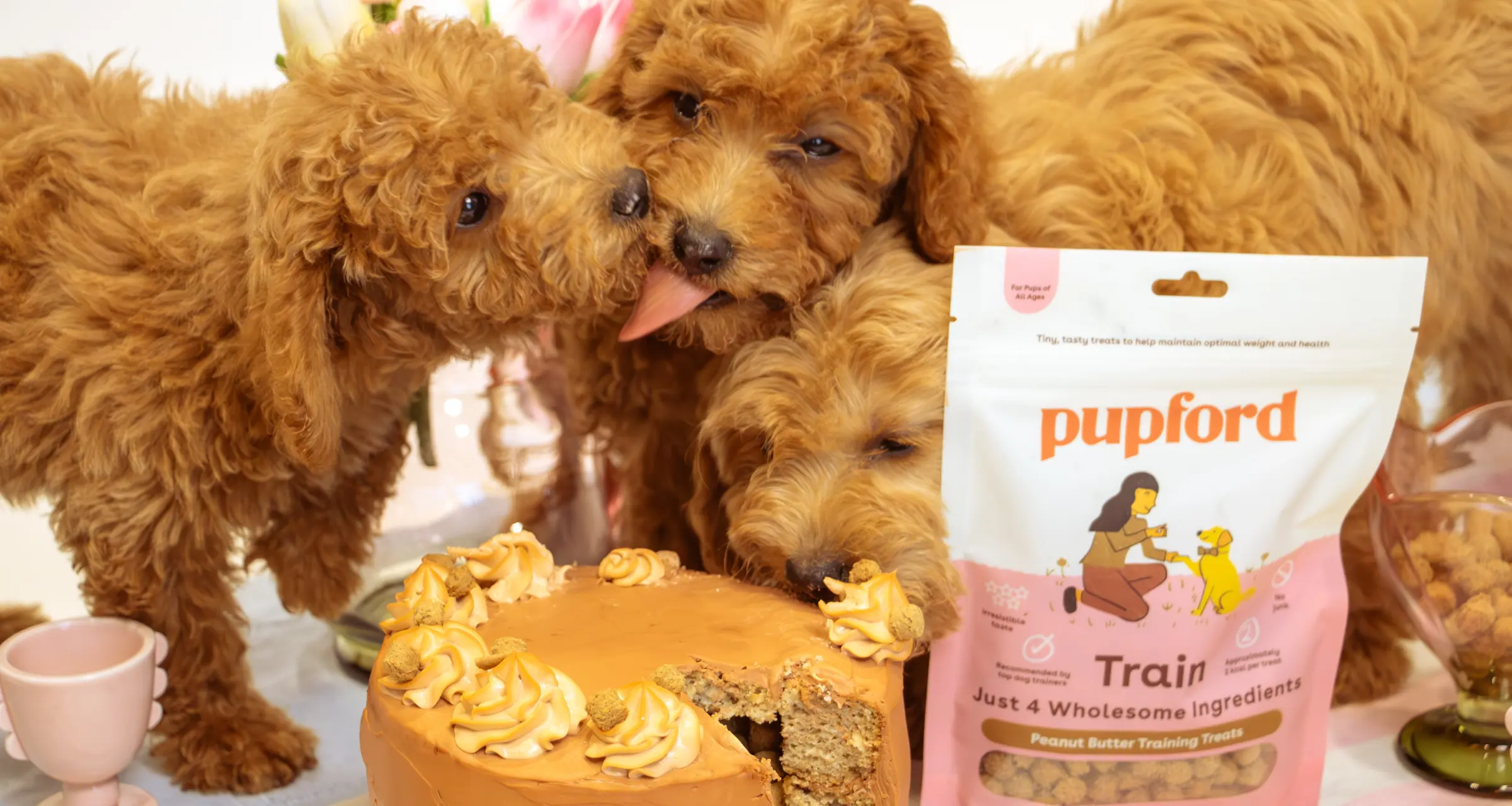
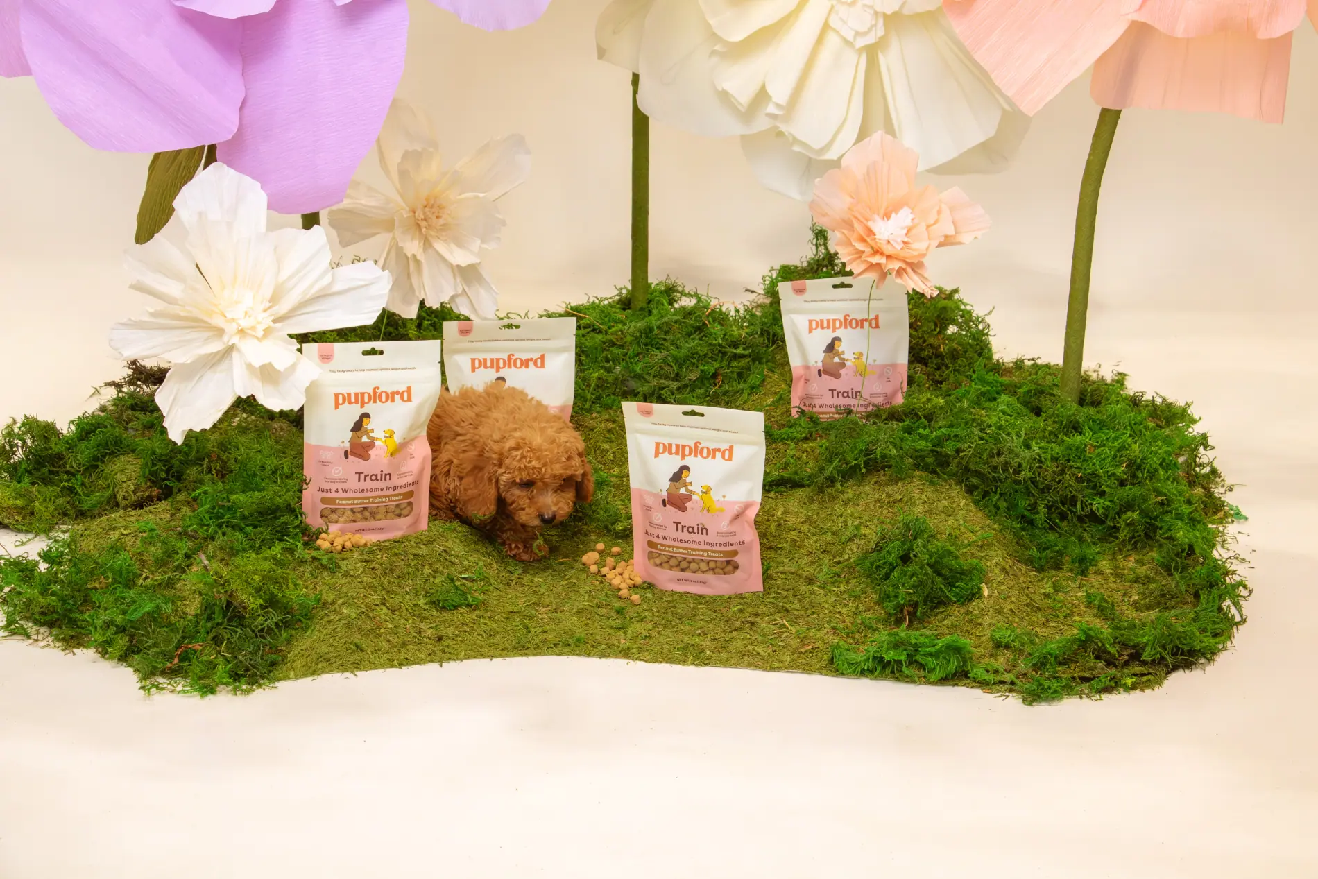
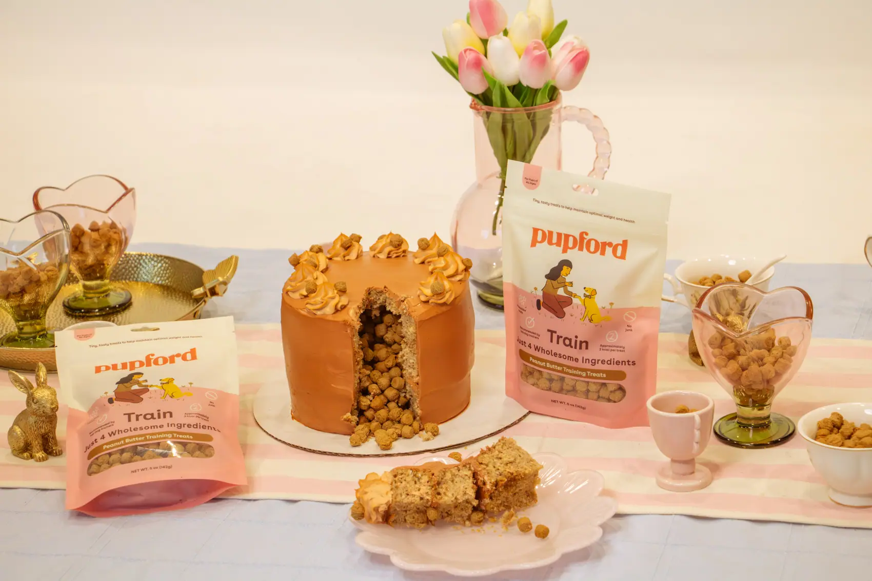
Peanut Butter campaign
Three pups, one cake, no second takesSet build · art direction · photography · retouch
One of five campaign shoots
Pupford sells food and training treats straight to pup parents who are two scrolls away from a competitor. That splits the design work in half: the brand side has to feel hand-drawn, warm and genuinely fond of pups, while the performance side has to survive a paid feed where the first half-second decides everything.
Working in-house meant owning both ends of the same system — art directing and shooting the campaigns, cutting the ads out of that same library, and turning the illustration set loose across social, email and print.
-
01
Campaign photography
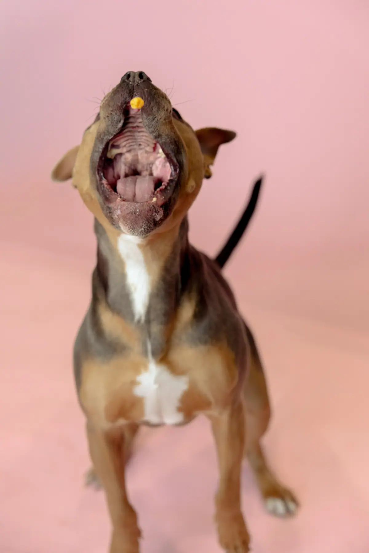
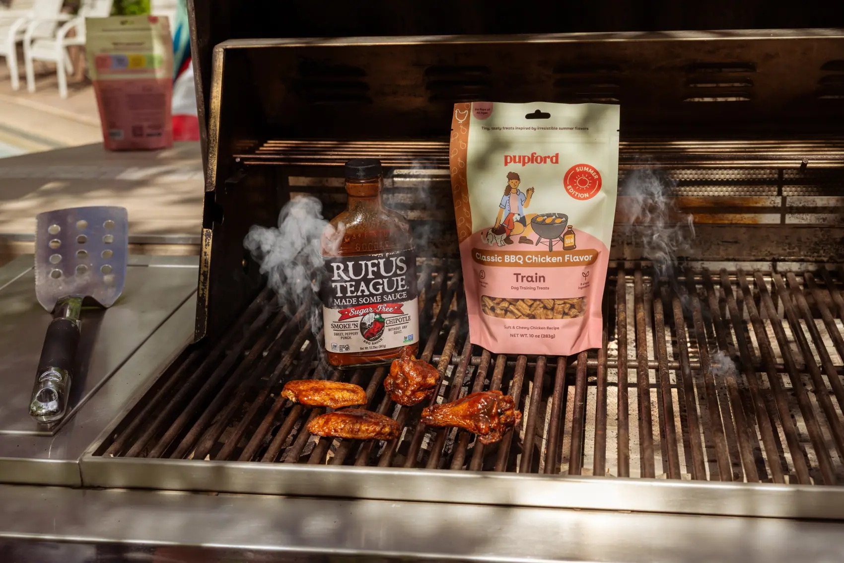
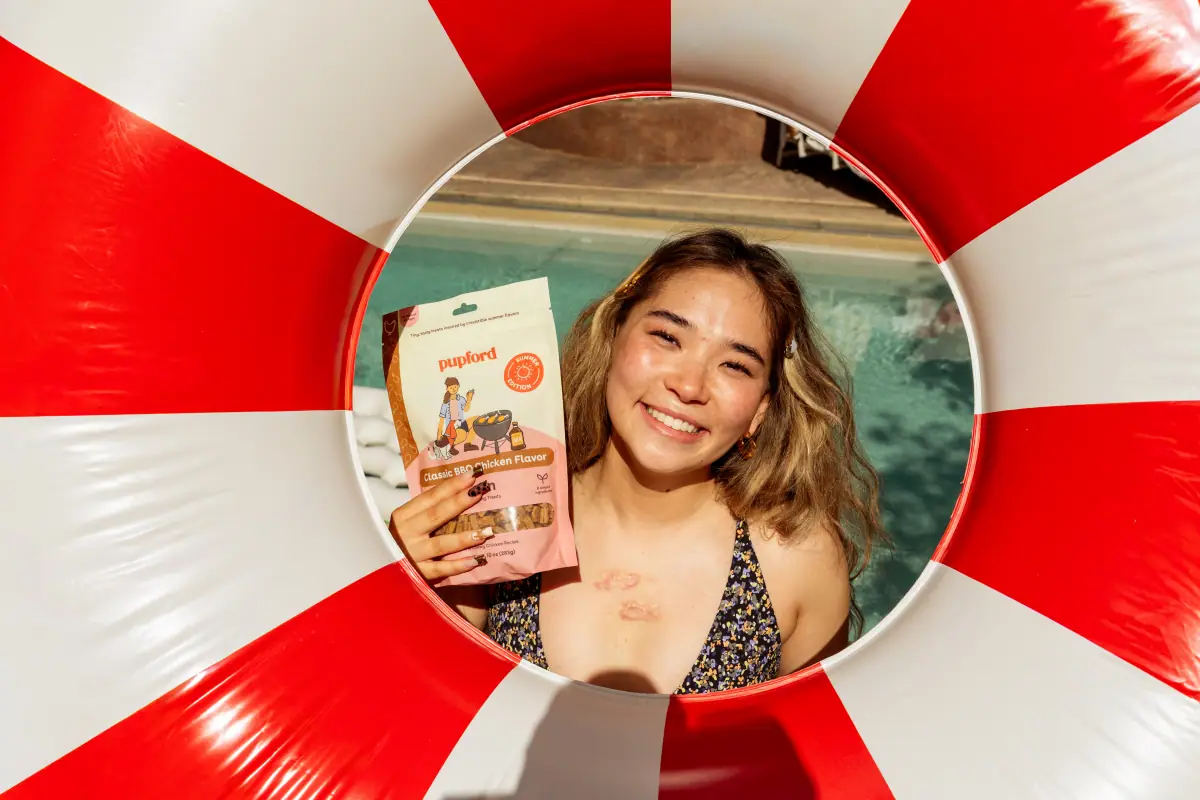
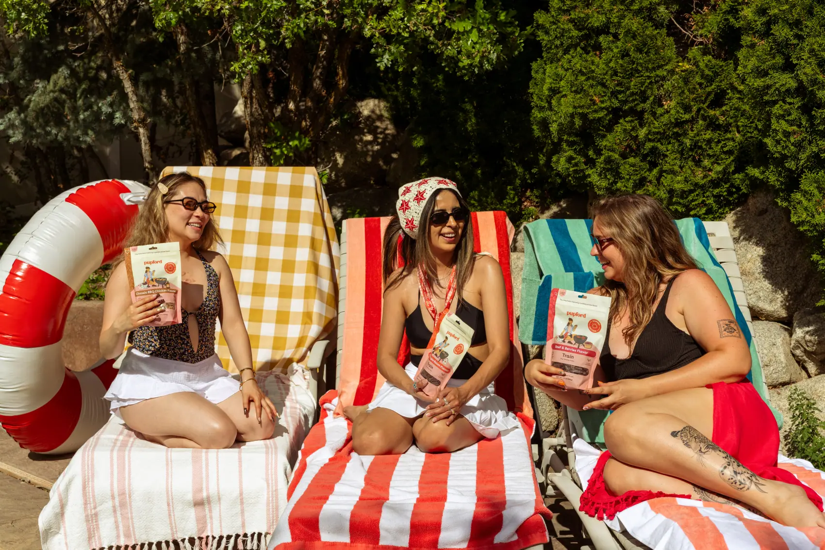
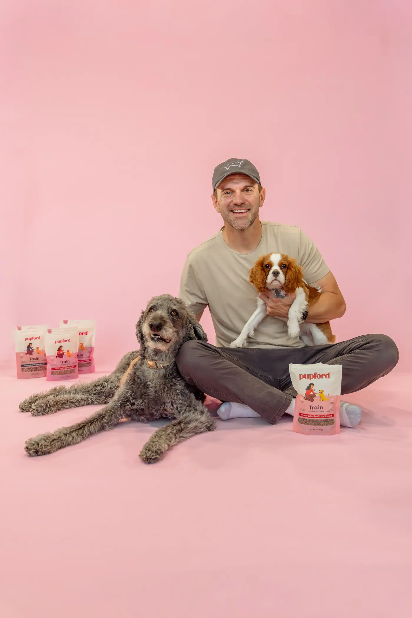
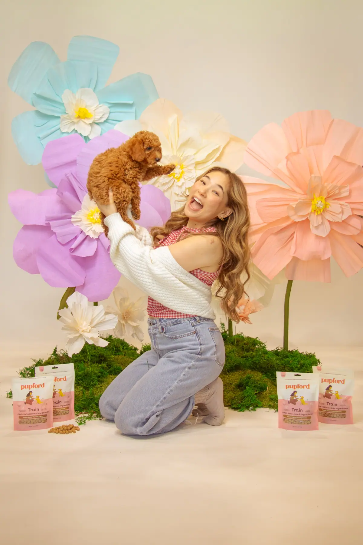
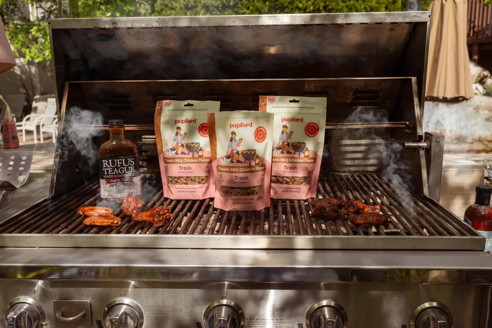
Five shoot days — Summer BBQ, the peanut butter set build, the pink and flower studio series, and product. Concept, styling, shooting and retouching.
-
02
Product photography
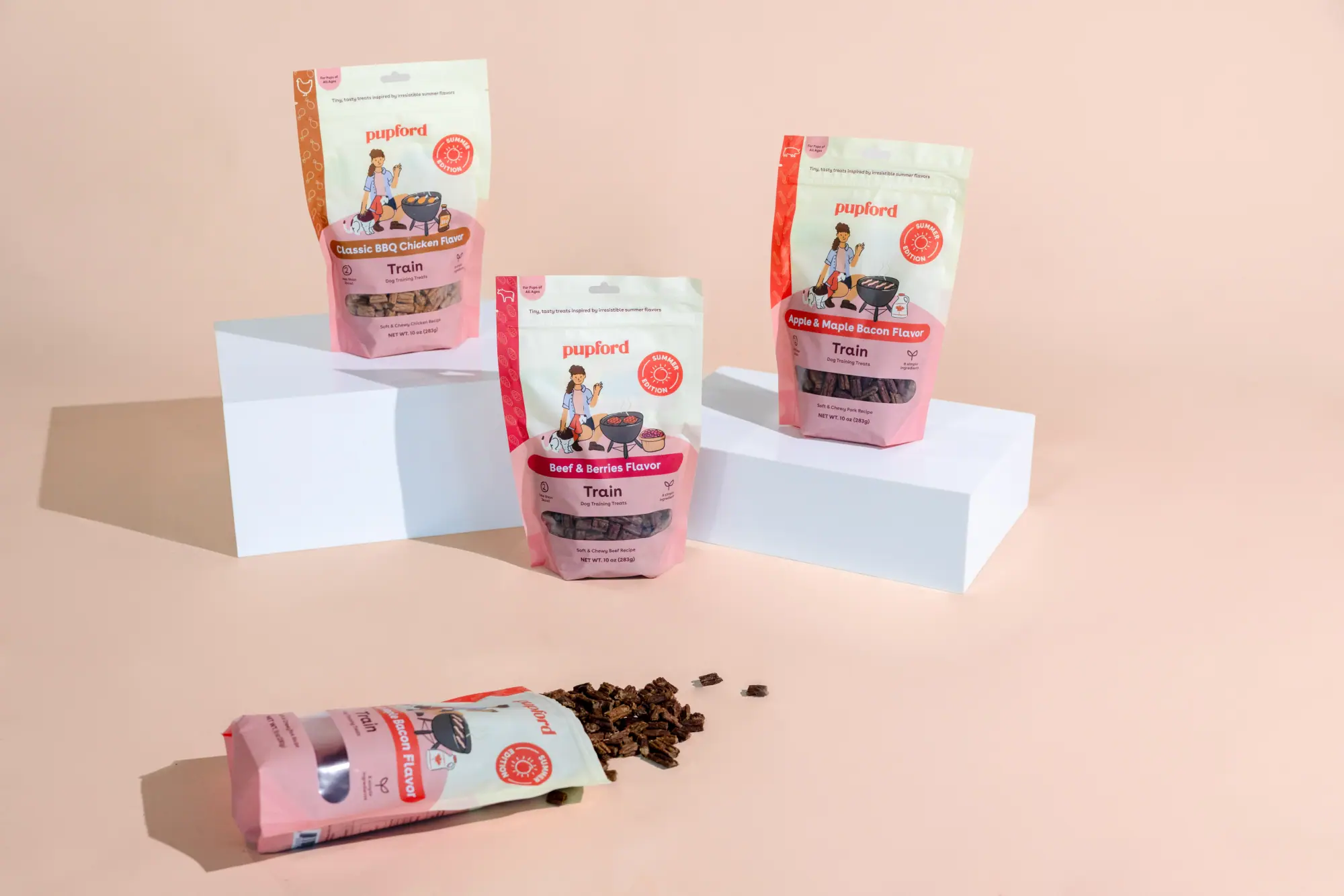
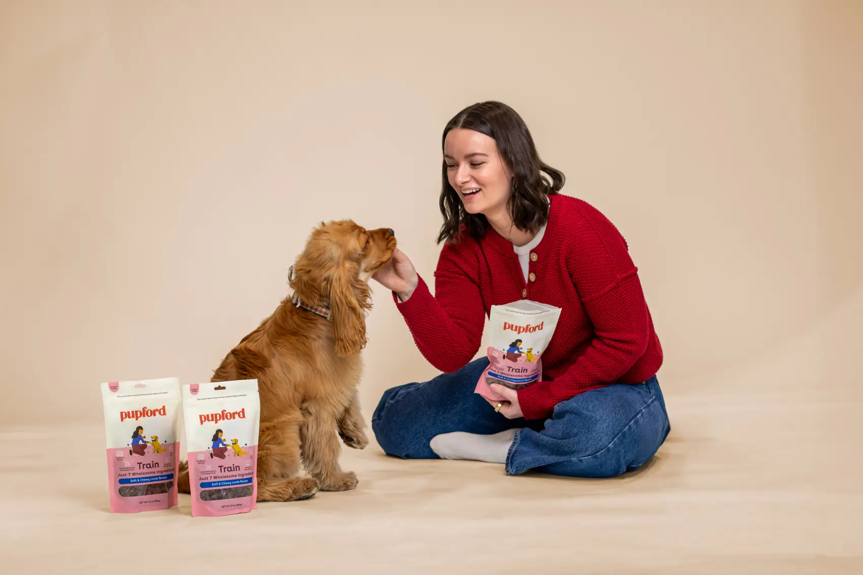
Clean packshots of the whole Good Dog Food and Train ranges, framed identically so flavour variants read as one system.
-
03
Landing pages
Long-form Good Dog Food builds with tested angles — a product-led desktop page, a nutrition-authority variant, and a mobile listicle.
-
04
Paid social & static ads
Ad sets built as sequences and as colourway families, so a winning concept can be re-cut for a new audience without a new shoot.
-
05
Illustration system
An original cast of hand-drawn pups — Procreate, Dry Ink brush, always on Chiffon Cream — running through packaging, social and email.
-
06
Editorial carousels & email
Educational carousels, a twelve-part recipe series, and lifecycle email built on the same illustrated language.
Campaign shoots
05Landing page builds
03Disciplines owned
0602 — The kit
Two colours, seven lines, one typeface
Pupford Brand Guidelines v1.0 / the rules every
photograph, pack and ad on this page is built against
Pupford Persimmon Red
PMS 7417 C · C0 M82 Y82 K0 · R225 G79 B61 · #E14F3D
Logotype and typography — used sparingly so it never overpowers the segment colours.
Pupford Chiffon Cream
PMS 9141 C at 35% · C2 M1 Y10 K0 · R252 G249 B233 · #FCF9E9
Background, logotype and illustration ground — every hand-drawn texture sits on it.
Secondary colours only ever appear as full floods, or paired with Chiffon Cream. Each line segment carries its own darker shade for type and illustration.
Train
PMS 169 C
C0 M34 Y21 K0
#FFB3B9
Type & illustration
PMS 7631 C
#572D2F
Engage
PMS 2717 C
C32 M13 Y0 K0
#A8C7FE
Type & illustration
PMS 7546 C
#25384A
Reward
PMS 122 C
C0 M9 Y80 K0
#FED34C
Type & illustration
PMS 5815 C
#565126
Health
PMS 358 C
C32 M0 Y51 K0
#ADDD9B
Type & illustration
PMS 553 C
#274736
Calming
PMS 522 C
C24 M40 Y0 K0
#B99CCF
Type & illustration
PMS 2627 C
#3D0F58
Cognition
PMS 224 C
C5 M64 Y0 K0
#EB6ECA
Type & illustration
PMS 229 C
#67214A
Gut Health
PMS 157 C
C0 M40 Y71 K0
#ECA25C
Type & illustration
PMS 161 C
#613E21
Typography — Buenos Aires
AaBbCc
ABCDEFGHIJKLMNOPQRSTUVWXYZ
abcdefghijklmnopqrstuvwxyz 1234567890!?@#$%^&*()_+
- BoldHeadlines, always title case
- BlackSub headlines
- Semi BoldSecondary type, call-outs
- Regular & ItalicBody copy
- Primary · Bold50 / 60 · auto
- Secondary · Semi Bold8 / 9.6 · auto
- Body · Regular13 / 15.25 · auto
Positioning
Good
Dog
Food
Iconography
Single line, varying weight, never filled.
Procreate, Dry Ink brush · same texture as the illustrations · Persimmon Red or PMS 7631 C, always on Chiffon Cream.
Illustration
The colour does the labelling: shirt and accessory take the flavour colour, trousers take the type colour.
Colour in Dry Ink for texture, details in Studio Pen for clean lines · Chiffon Cream always sits beneath the texture · every pup a different breed, every parent a different hairstyle and skin tone.
The shoot, the ad and the landing page are the same decision.
In-house, nothing gets handed off. One library, one system, and one person accountable from the set build all the way to the checkout button.
03 — Photography
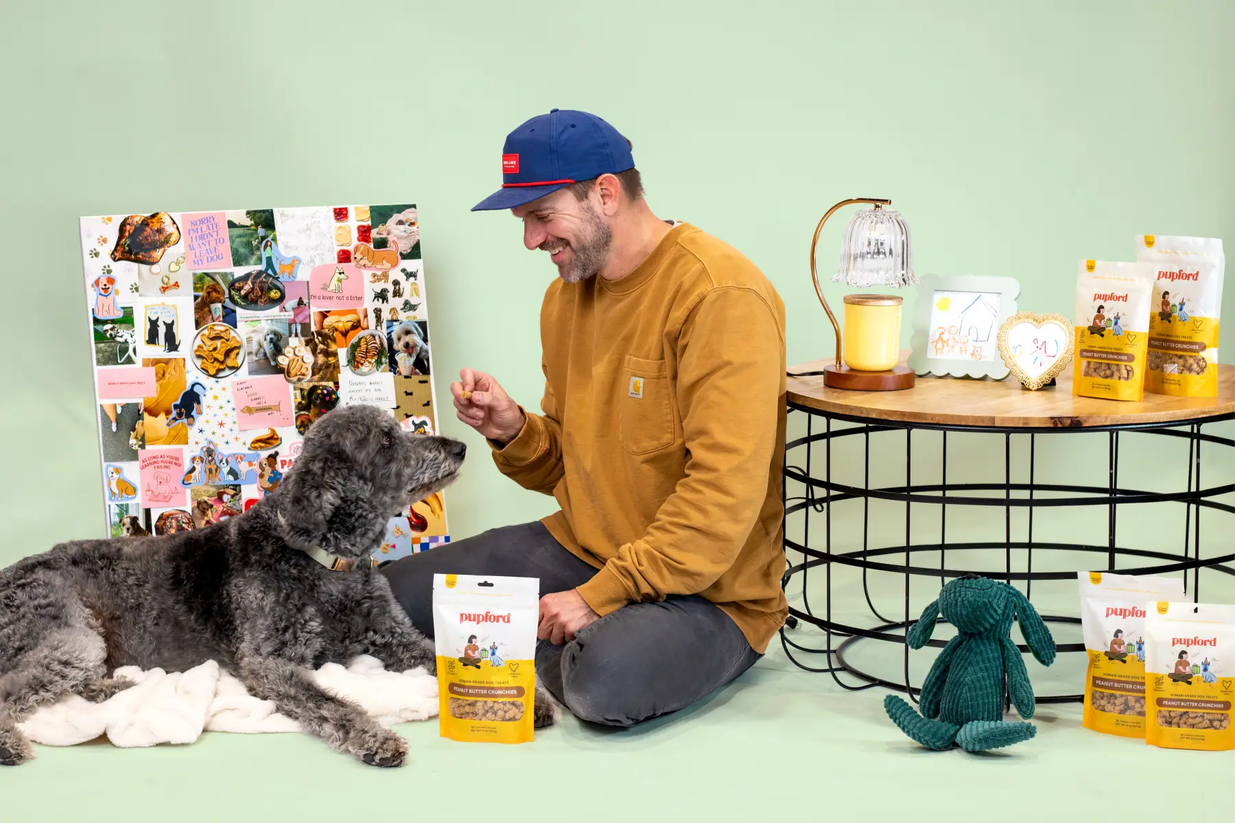
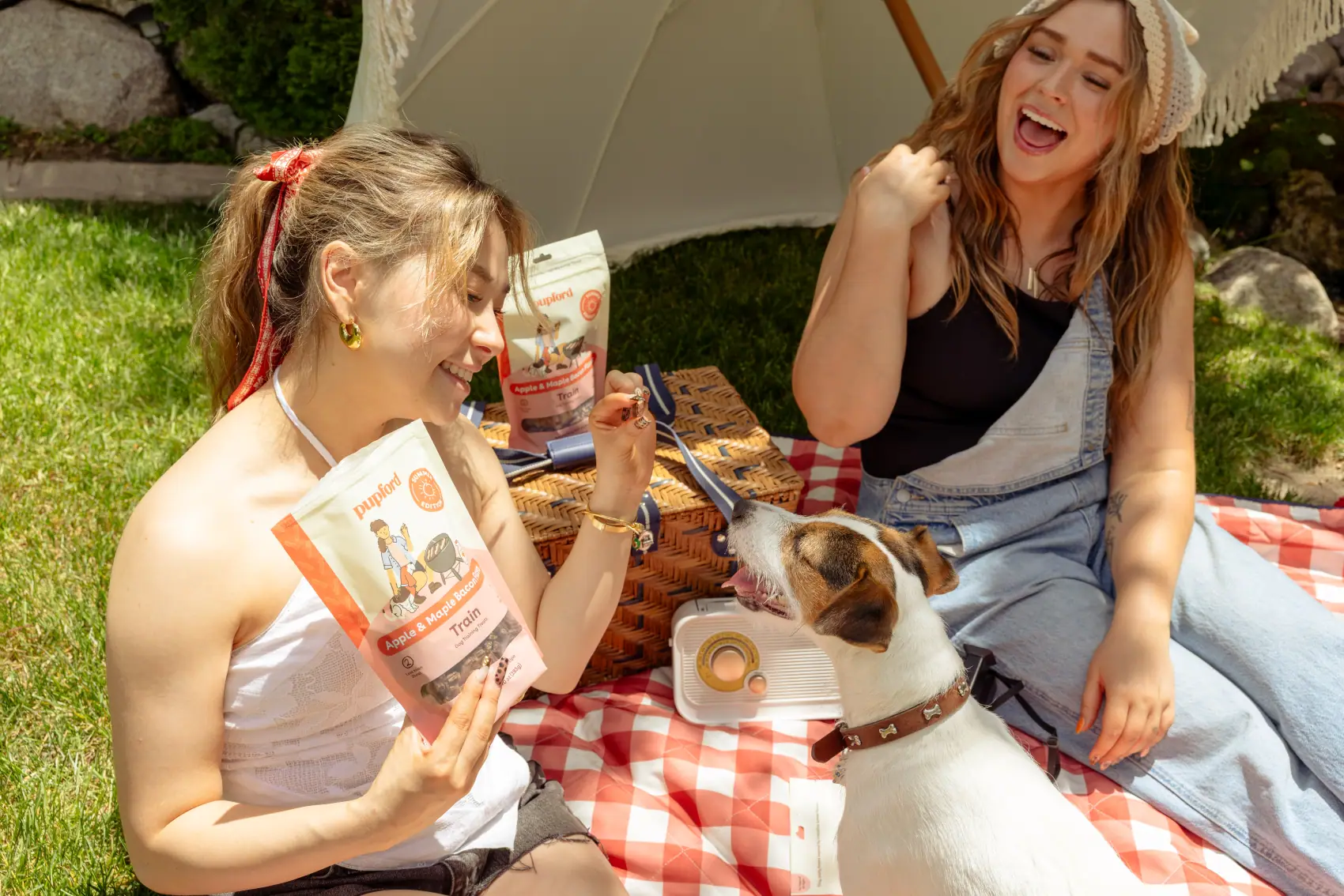
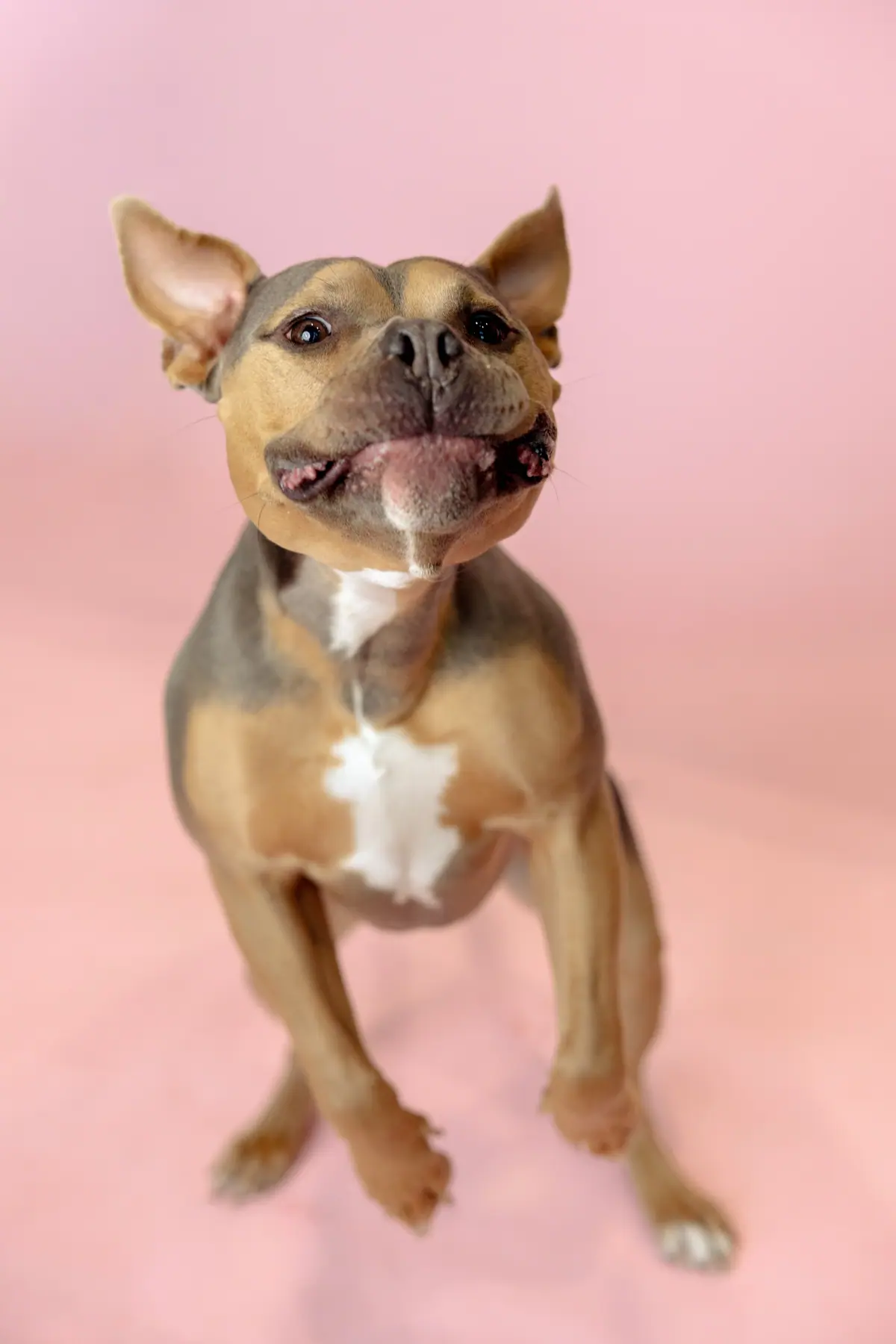
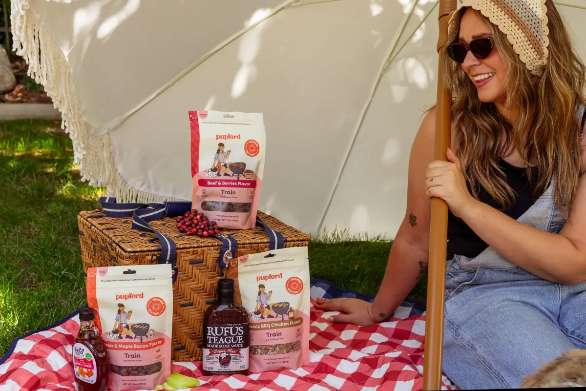
Sixteen frames, five shoots
Summer BBQ · Peanut Butter · studio · product
concepted, styled, shot and retouched in-house
04 — Packaging
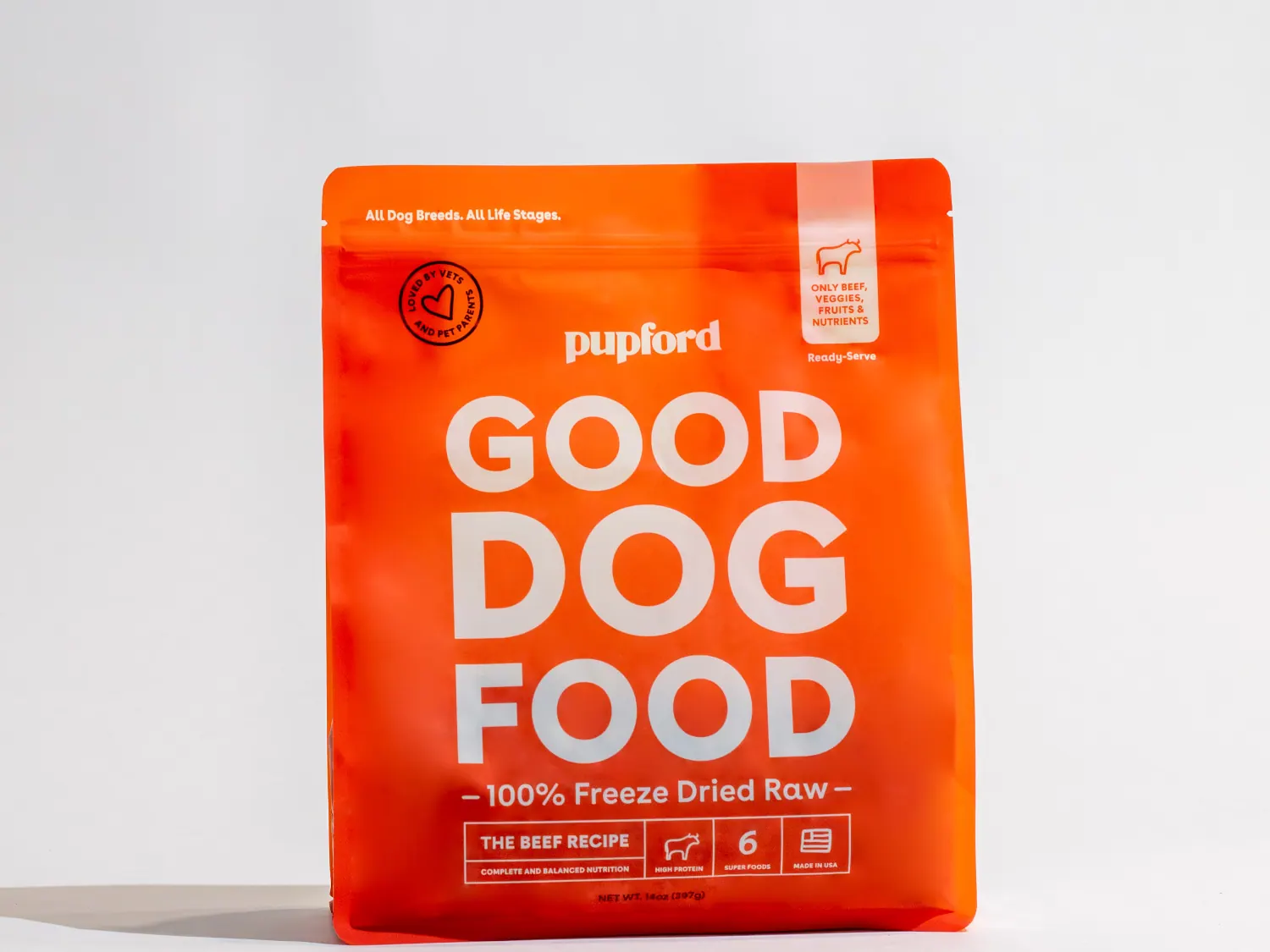
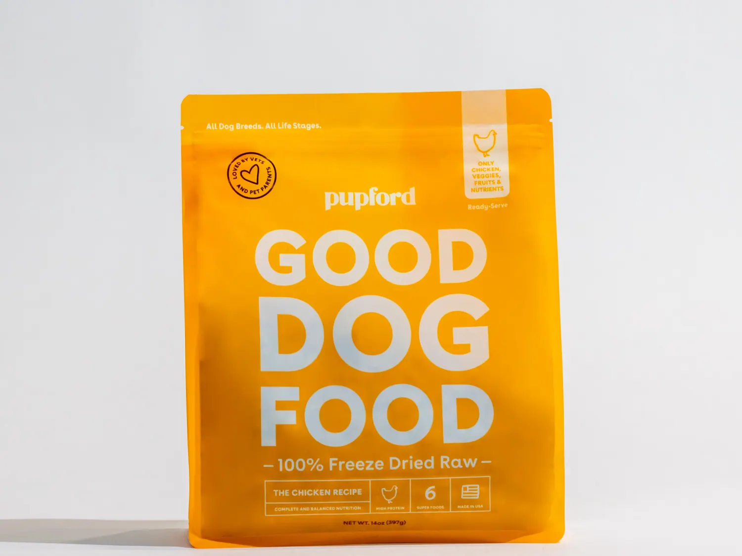
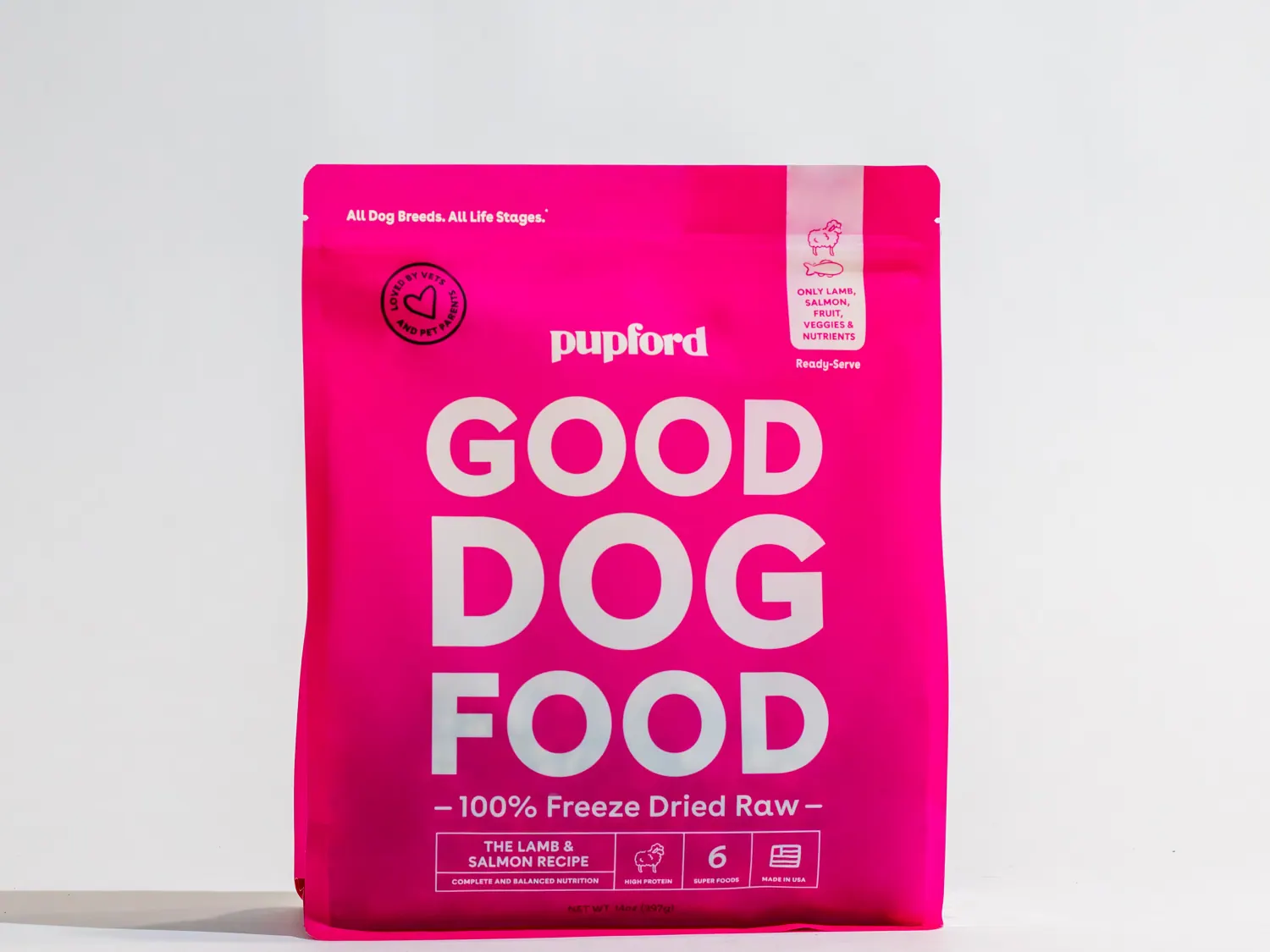
One pack, three proteins
Good Dog Food / identical framing, and a flavour colour
carried across every touchpoint for that ingredient
In context
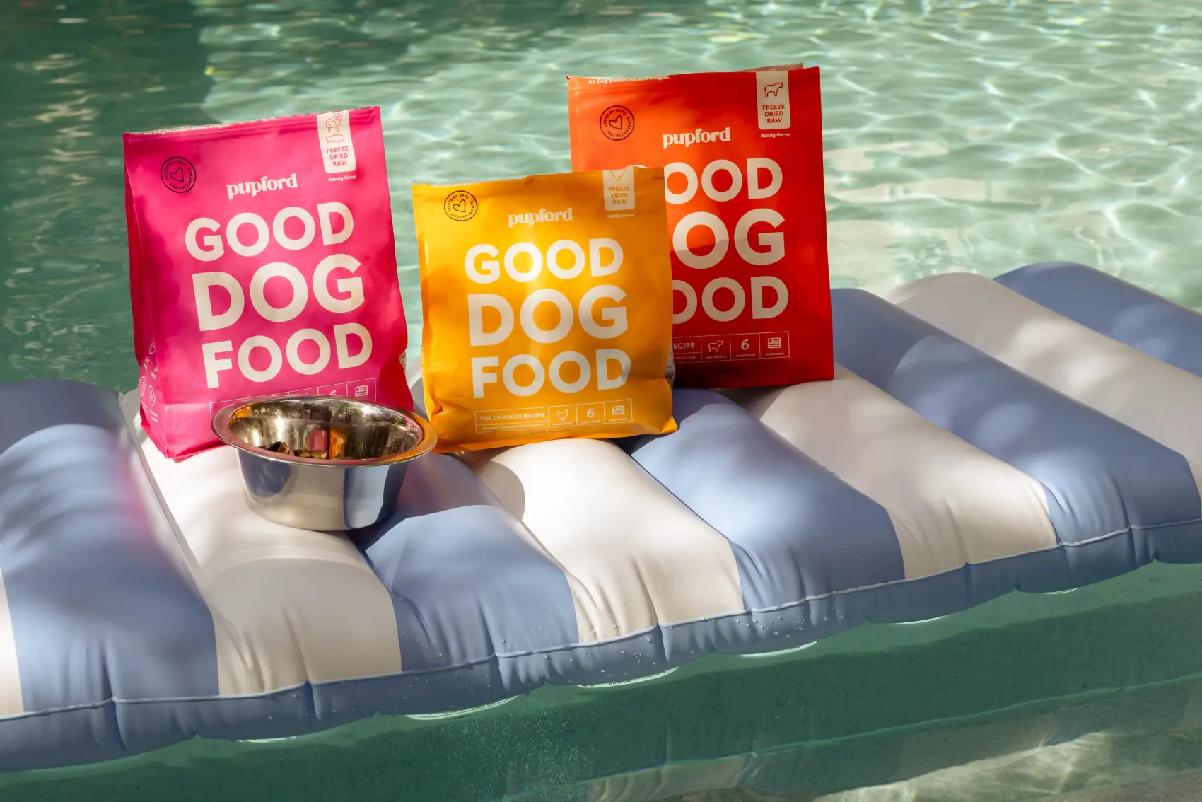
The pack has to work outdoors too
Summer BBQ shoot / the same packaging system
styled, lit and shot on location
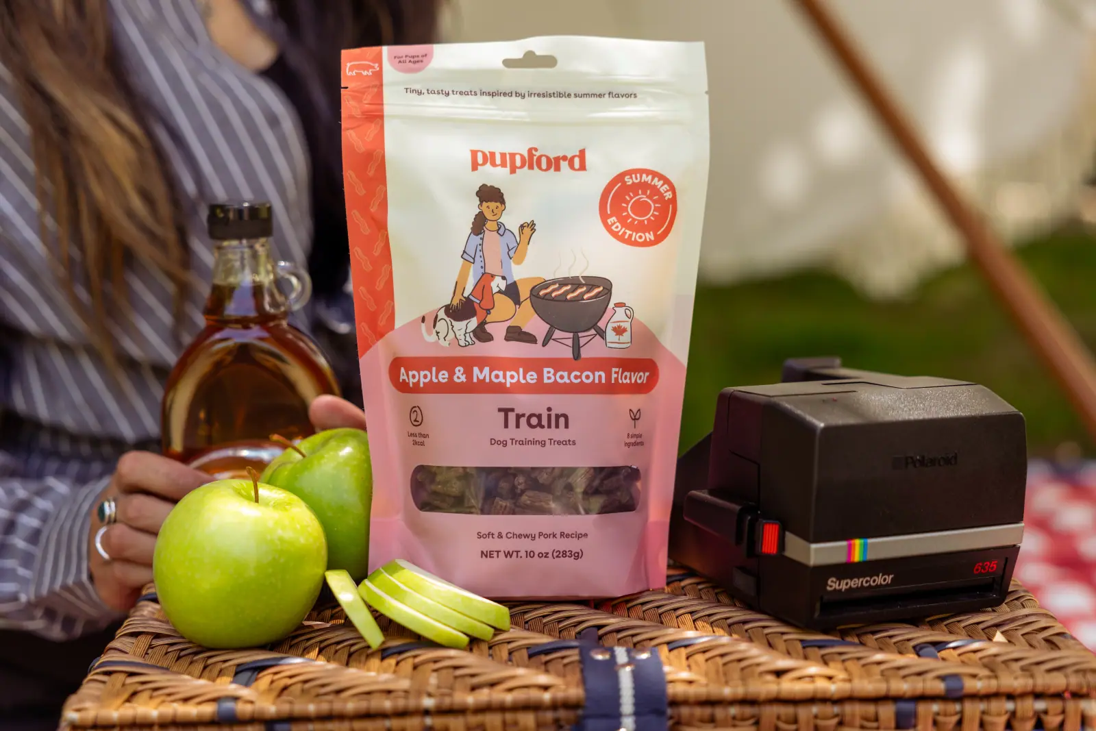
Train, hero packshot
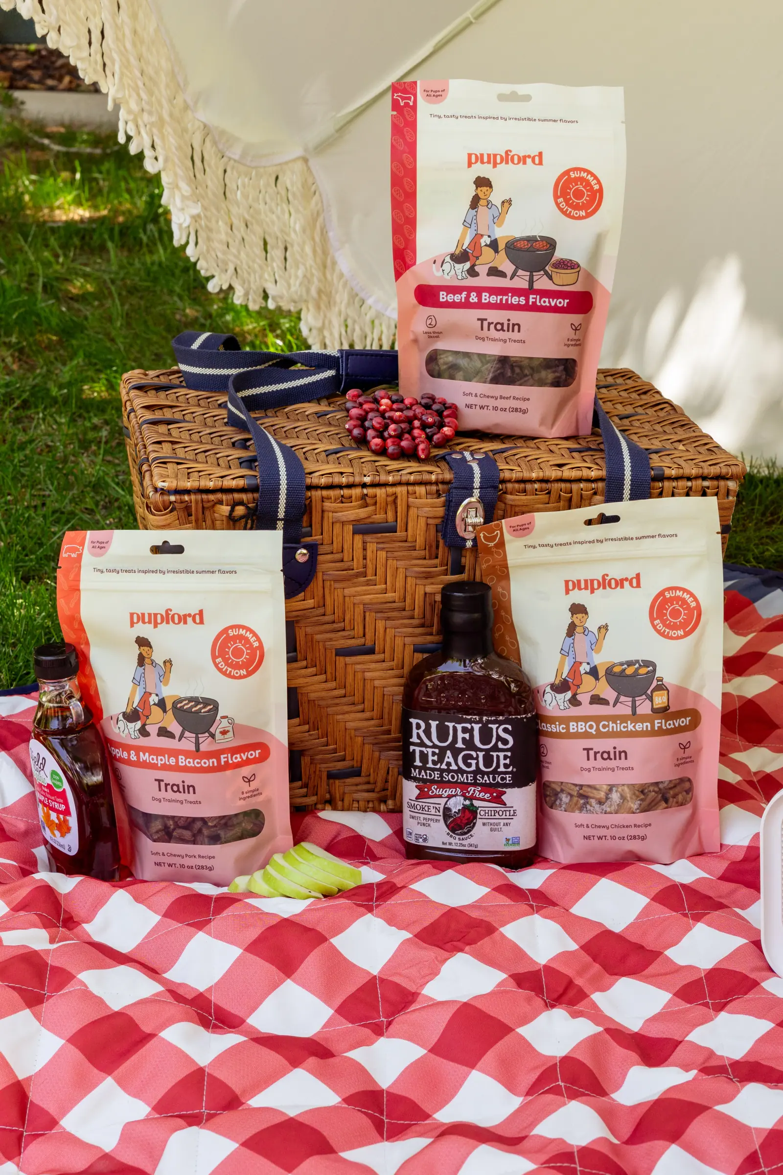
The range, grouped
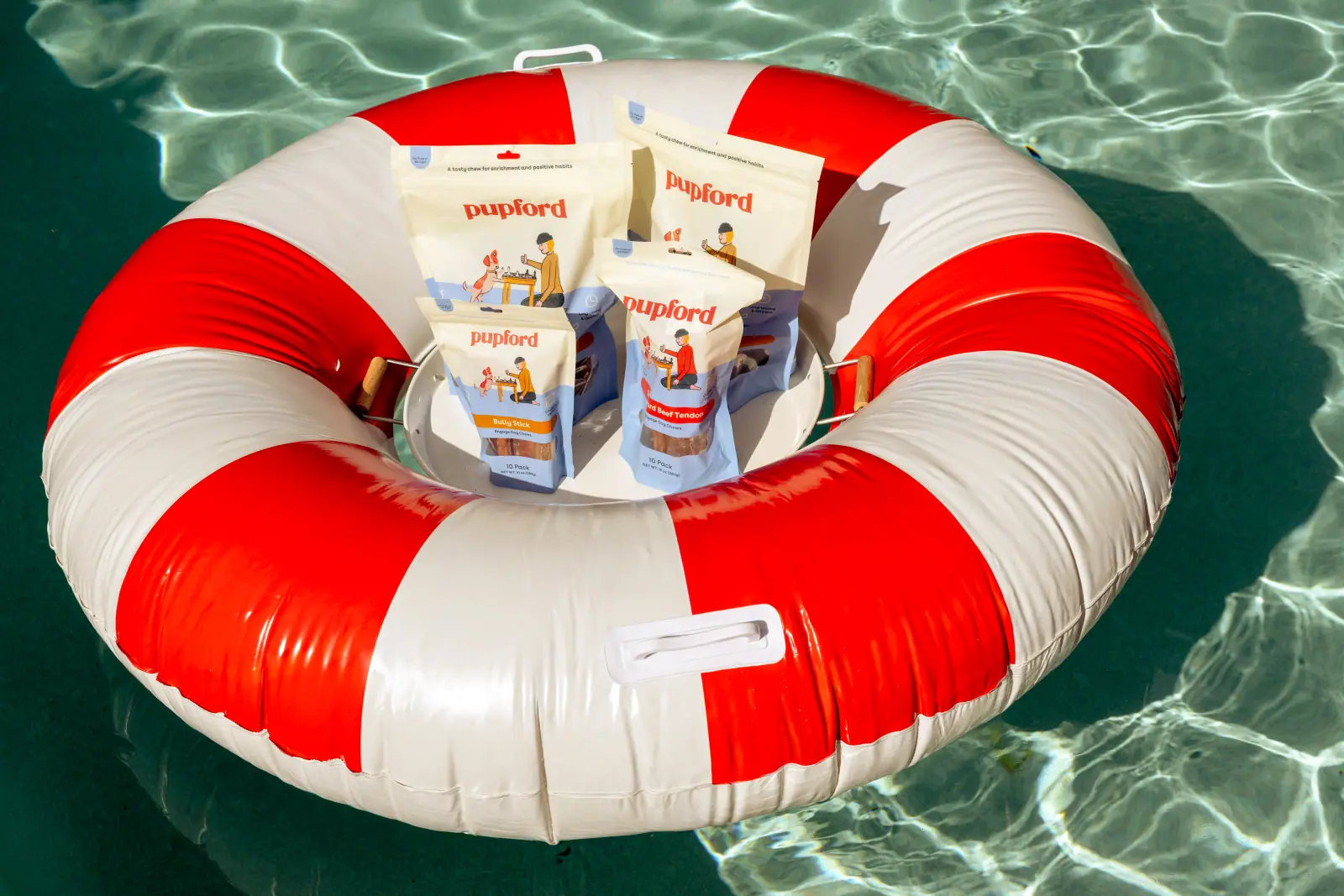
Seasonal styling
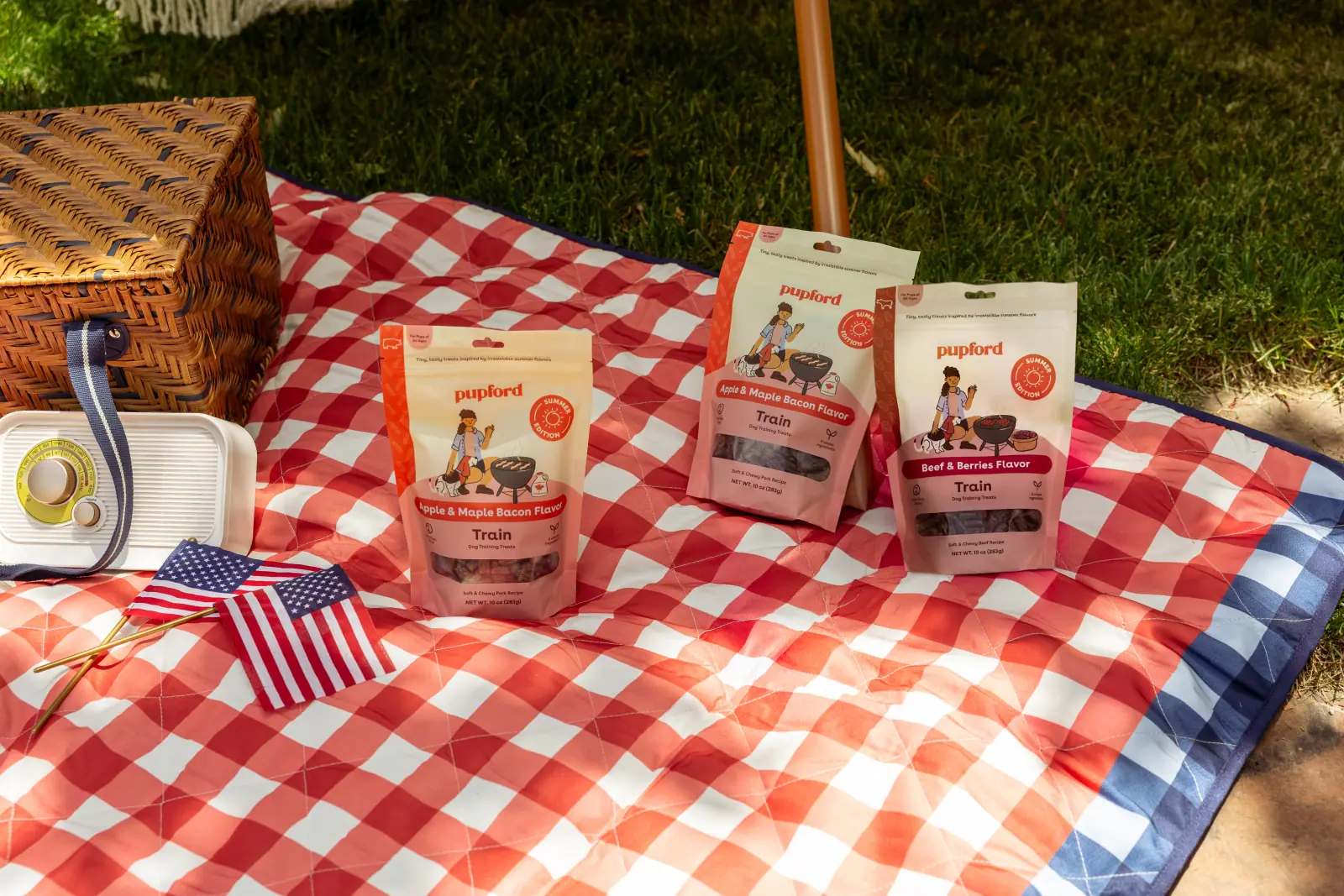
Set for the shot
Front-of-pack illustration
Classic BBQ Chicken, rough to shipped
Procreate / Dry Ink for colour, Studio Pen for line
six passes · every one answers a question the pack asks
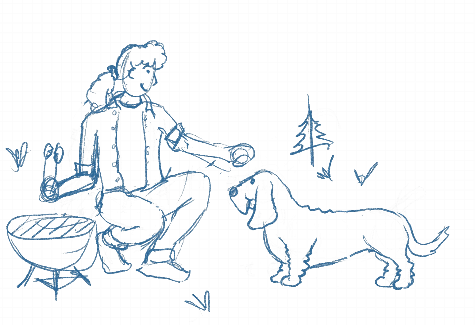
Blue pencil on the iPad grid. Pup parent crouched at the grill, treat in hand, basset waiting. The scene is settled here before a single colour goes down.
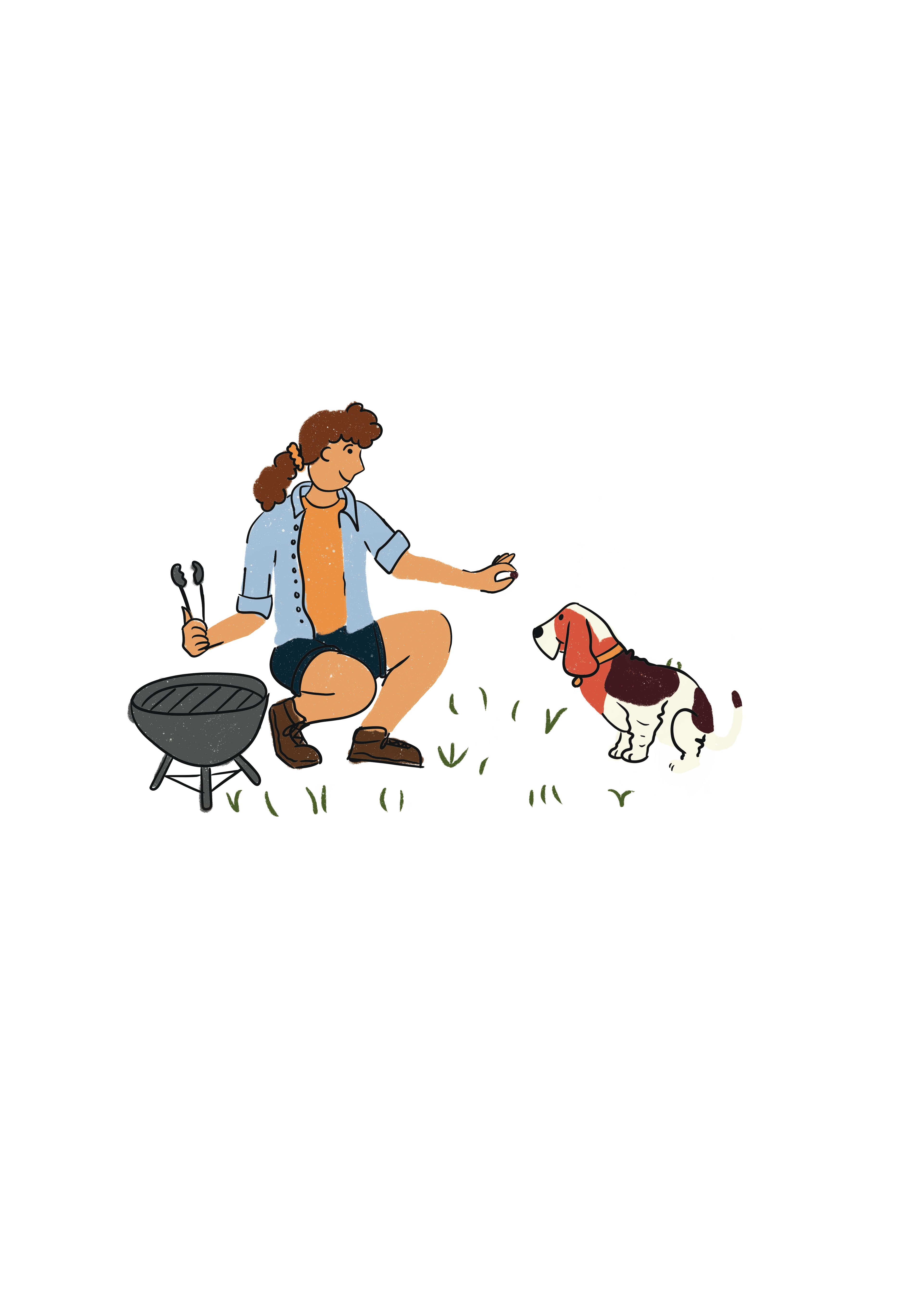
Line and flat colour. Tee on the flavour colour, shorts on the type colour, per the packaging guidelines. The pup is standing, polite, a little static.
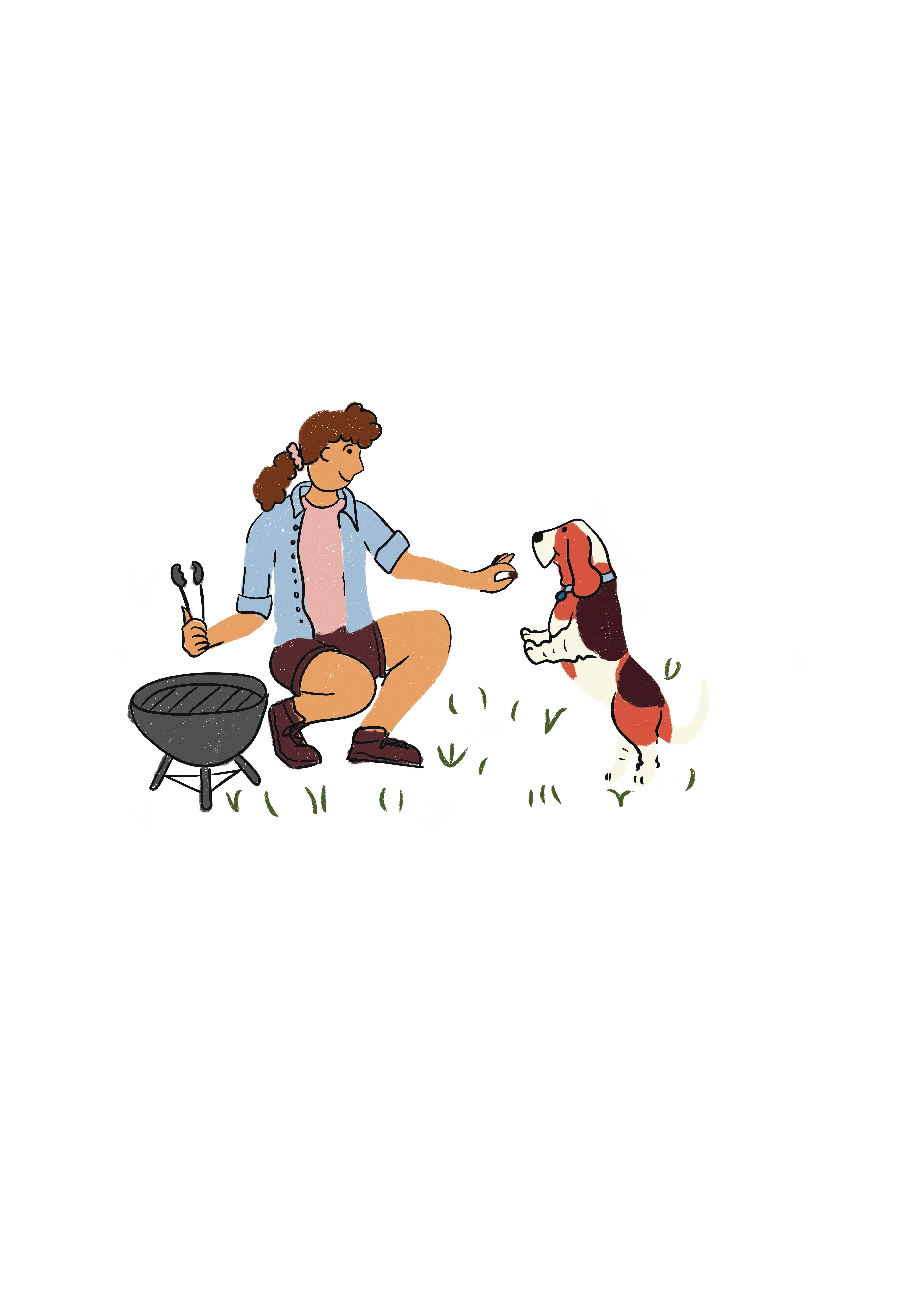
The pup gets up on its hind legs and takes over the shot. The tee swaps to Train pink so the figure sits with the bag it will live on.
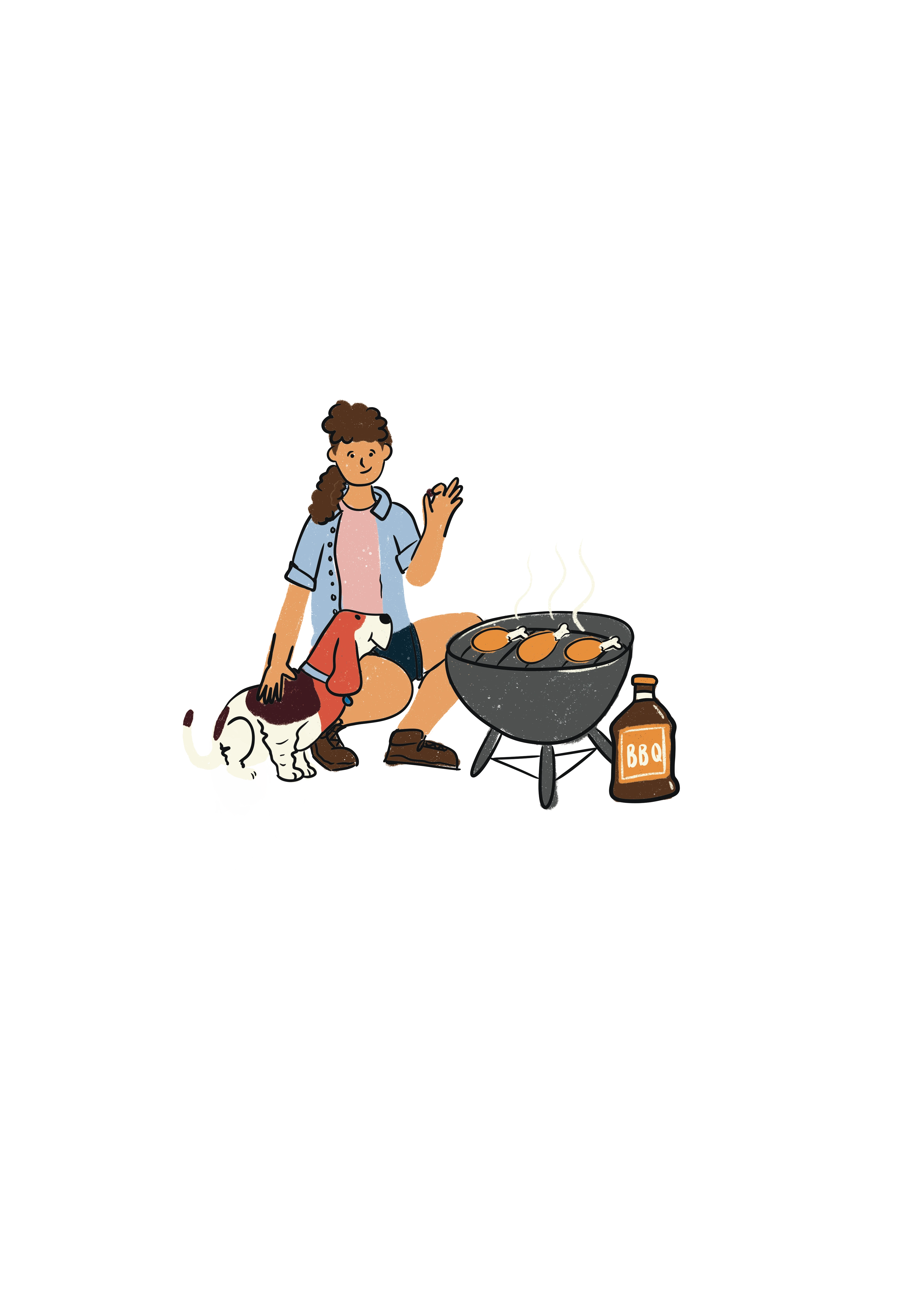
Chicken goes on the grill, smoke rises, the sauce bottle joins it. The pair are recomposed to sit low and wide for the band under the logotype.
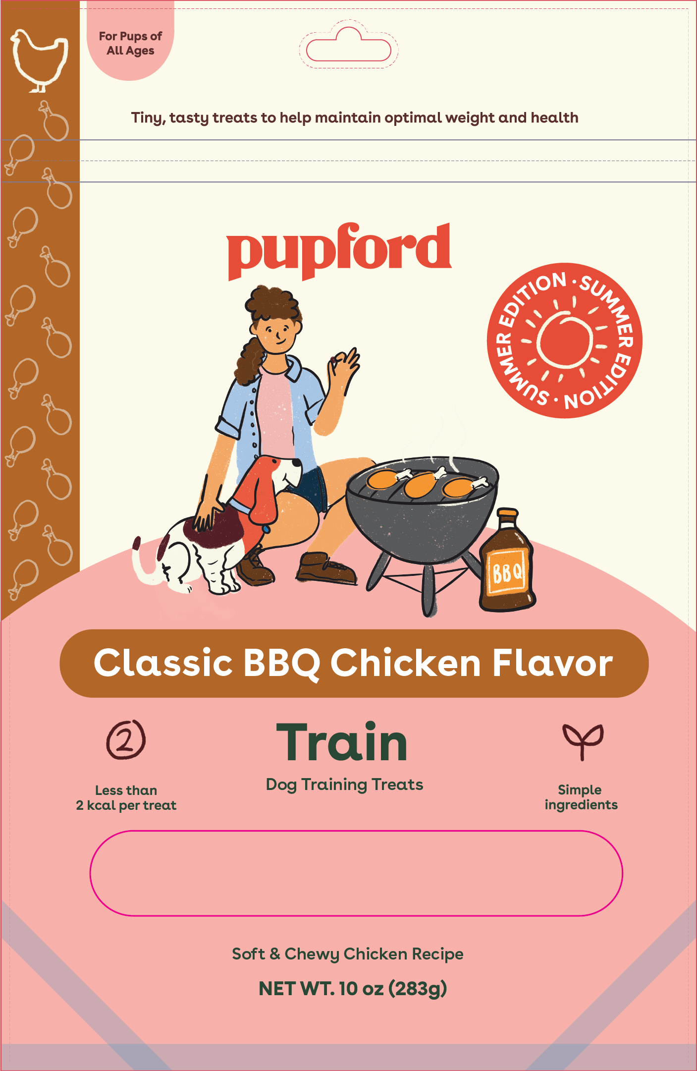
Dropped into the front-of-pack template: cream ground, pink hill, logotype above, flavour bar below. The Summer Edition roundel takes the top right.
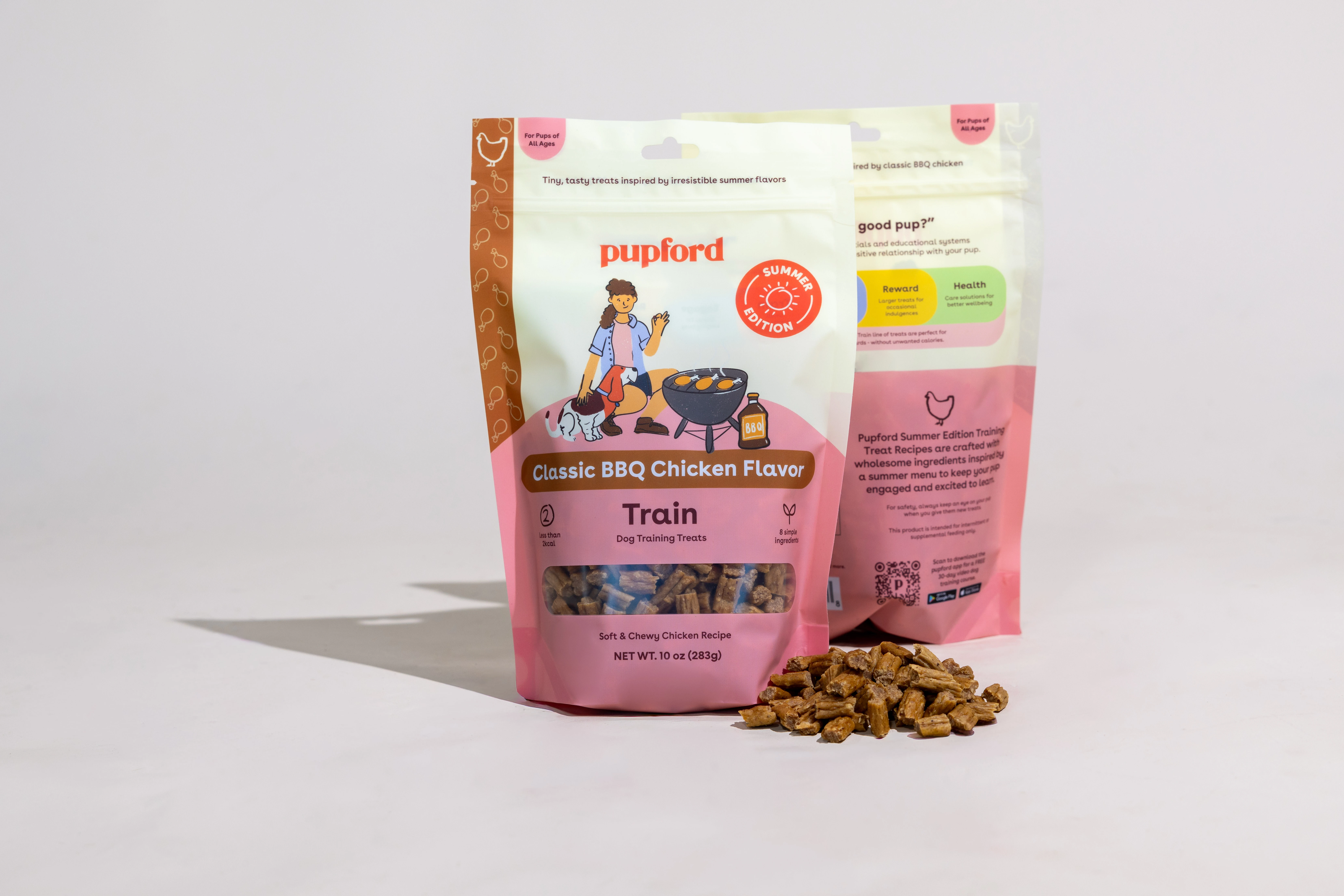
The printed bag, front and back, photographed in the studio with the treats out. Same scene, now at retail scale.
05 — Landing pages
Same product, three different arguments
Good Dog Food / hover a page to scroll it



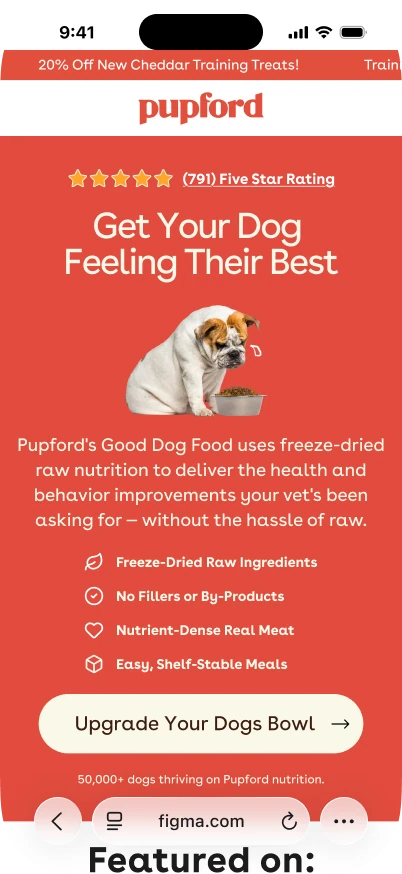
Conversion
Testing an angle should cost a layout, not a shoot.
The desktop build leads with the product and the promise. The nutrition build leans on ingredients and authority for a colder audience. The mobile listicle reframes the whole thing as an article — the reader is halfway down before it asks for anything.
All three are cut from the same photo library and the same illustration set, so a new argument is a day of layout rather than a new production.
06 — Paid social
Built as a beat, then re-cut
Static ad sets / sequences, colourway families and angle tests
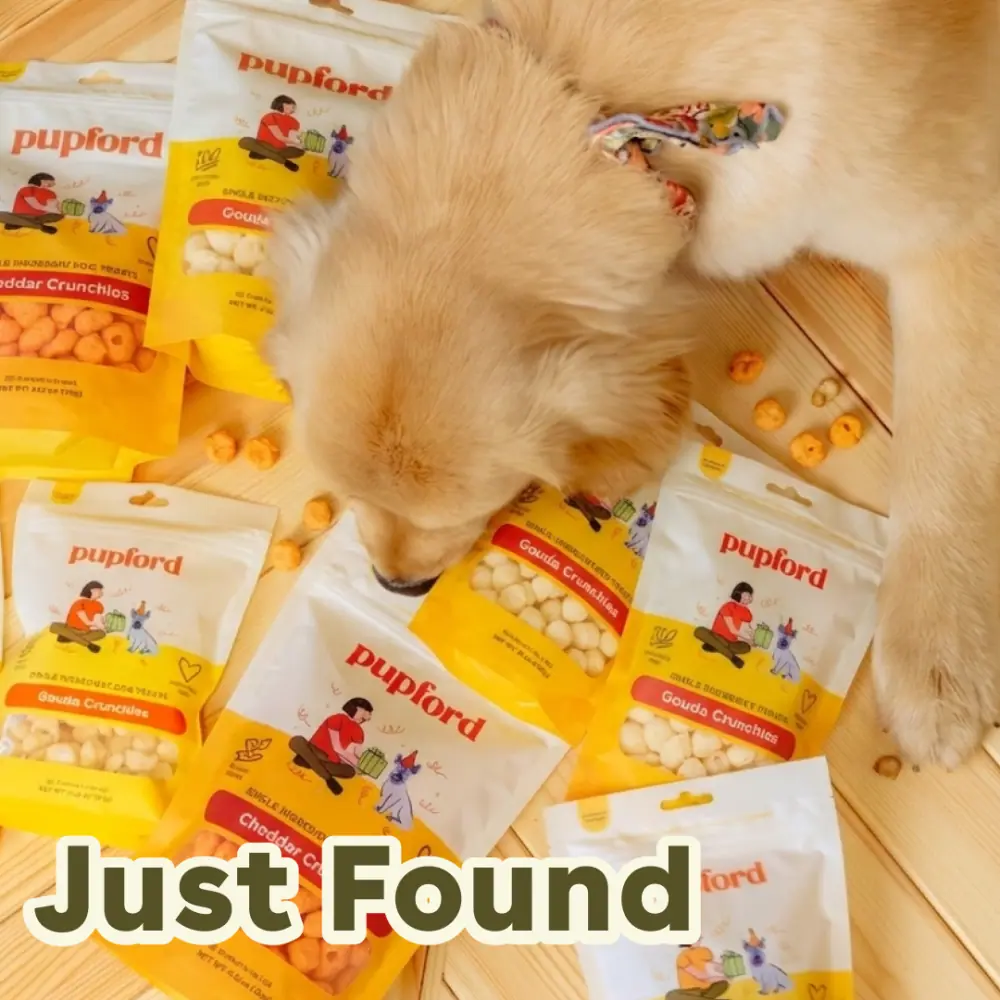
01Just found
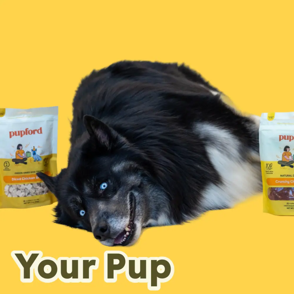
02Your pup
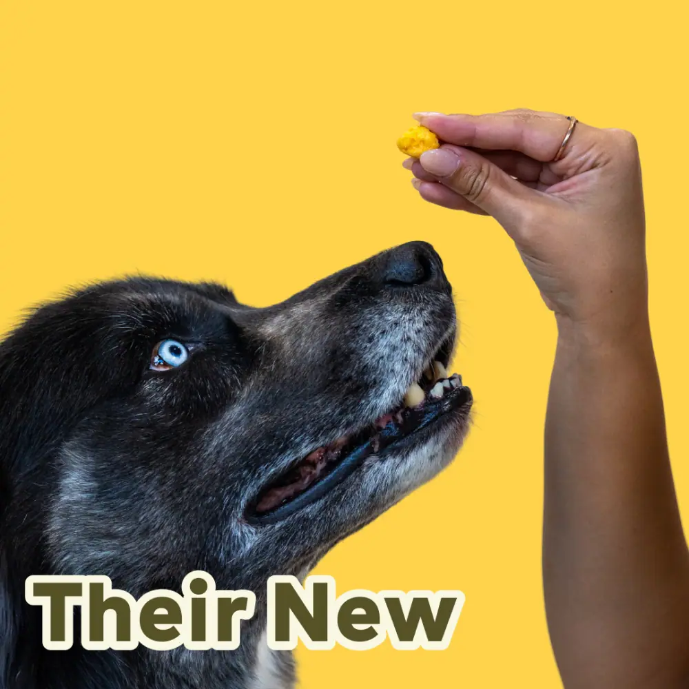
03Their new
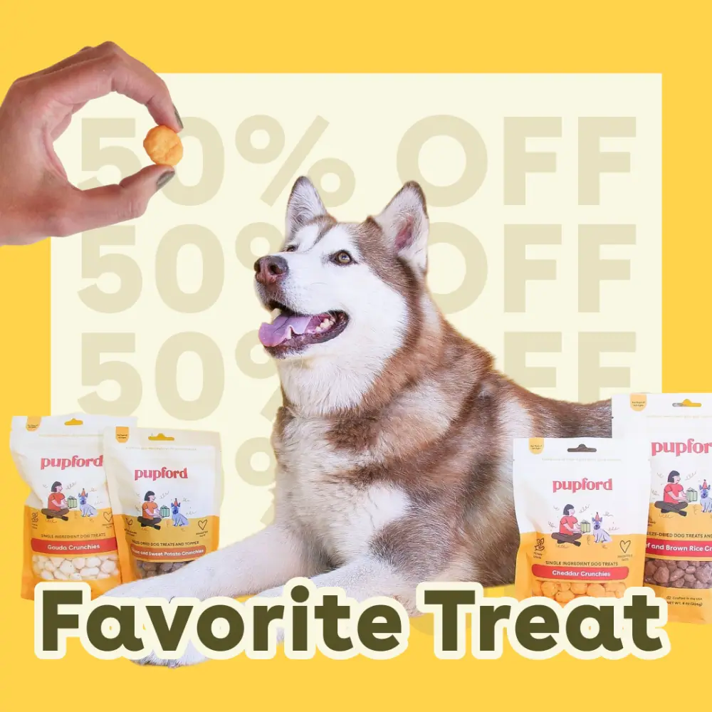
04Favorite treat
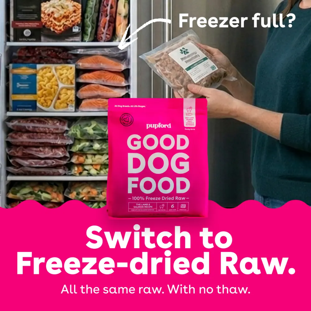
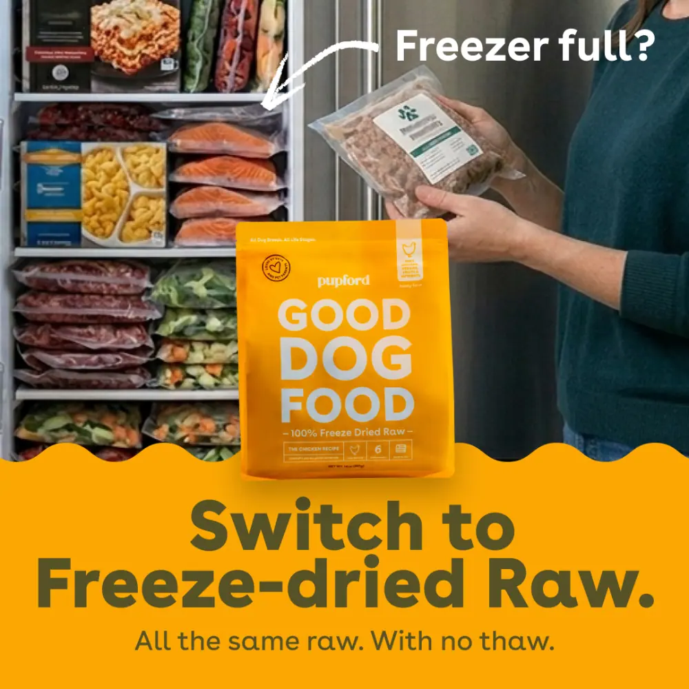
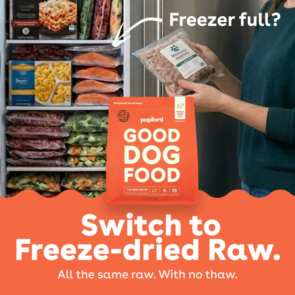 Salmon · PMS 1915 C
One concept, three colourways
“Switch to Freeze-dried Raw”
The same frame, the same crop, the same headline — only the flavour colour changes. Three audiences, three creatives, one build. The flavour palette does the segmenting so the concept never has to be re-shot.
Campaign · training
Is your dog walking you?
Five concepts / each built twice, 9:16 and 1:1
so the story cut and the feed cut ship together
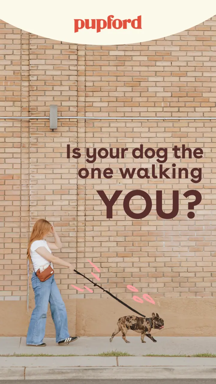
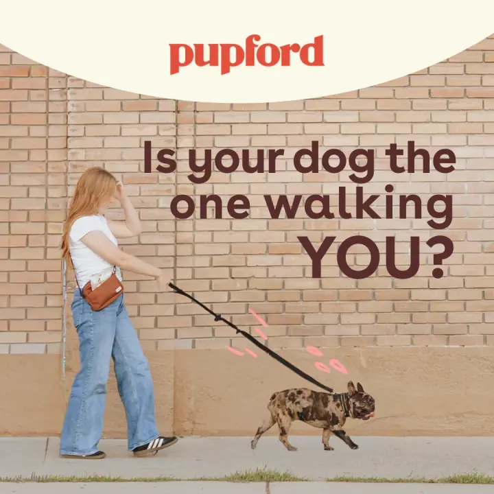
“Walking YOU?”Brick wall, full pull
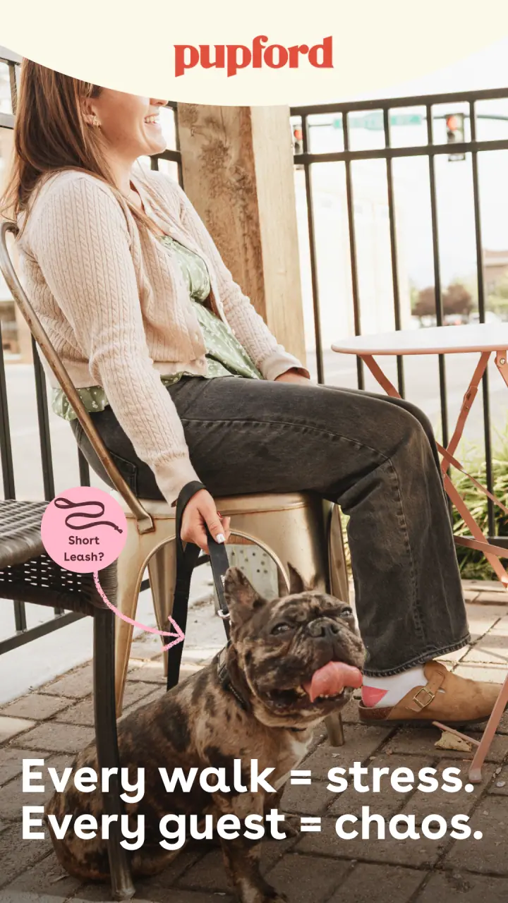
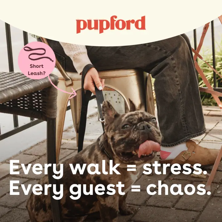
“Every walk = stress”Café patio
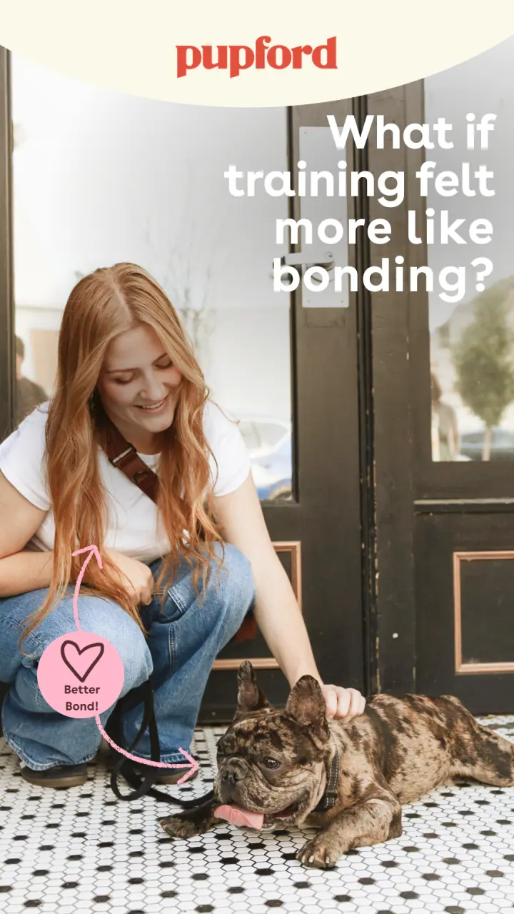
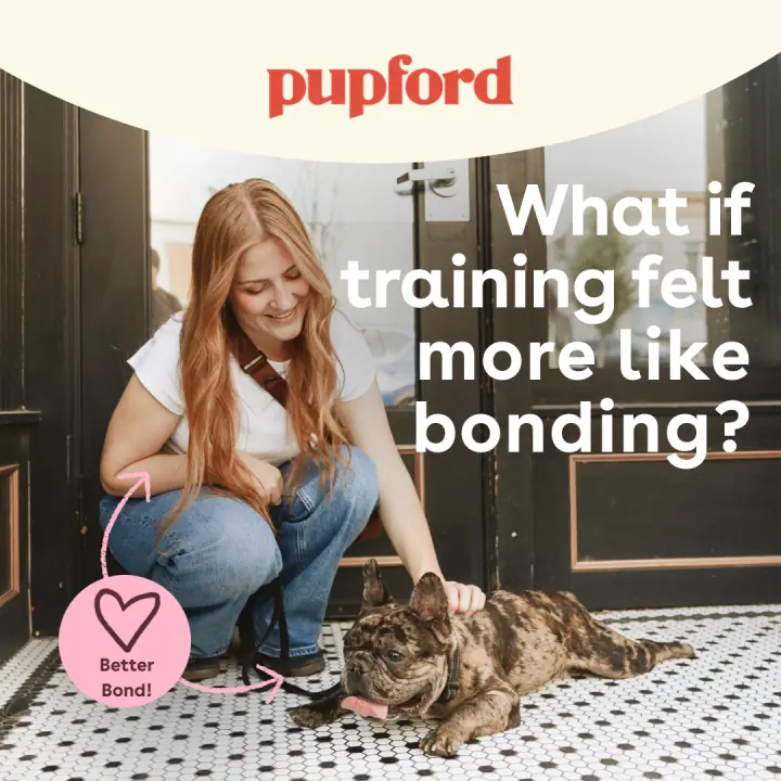
“More like bonding”Doorway, tiled floor
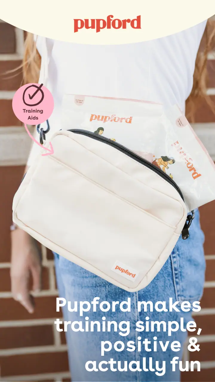
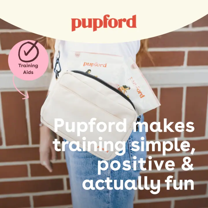
“Simple, positive & actually fun”Treat pouch detail
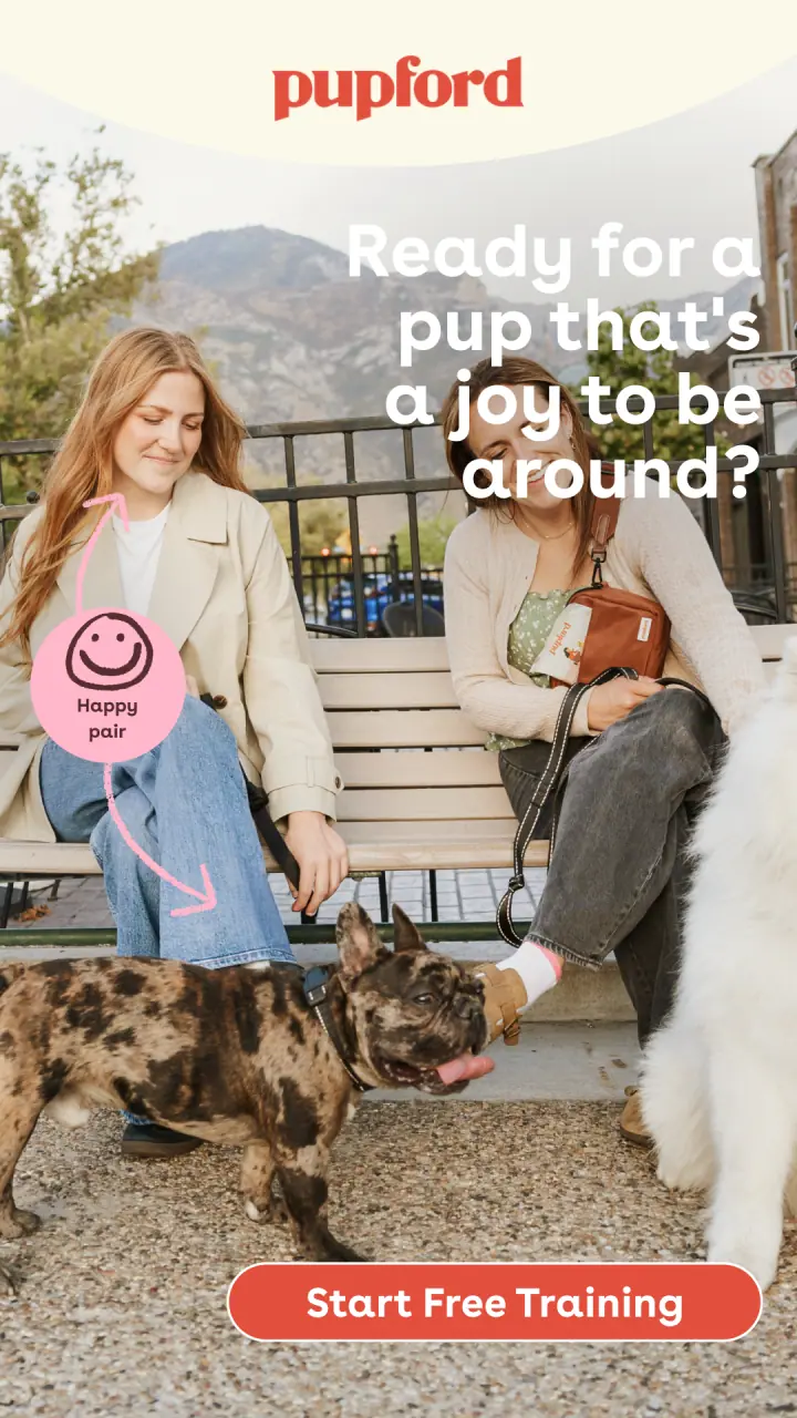
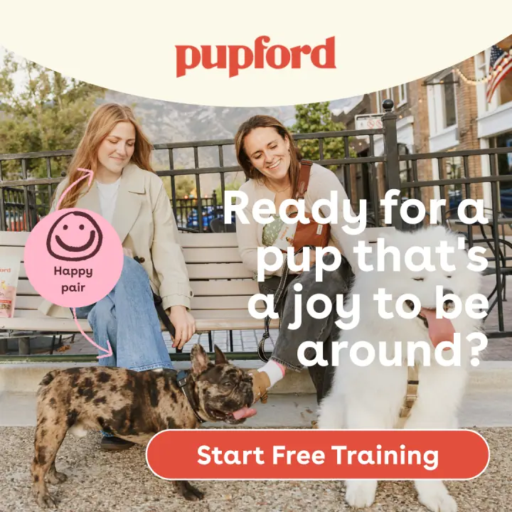
“A joy to be around”Bench, two pups
Campaign · seasonal
Memorial Day Sale
One offer, five angles / polaroid, review-led, product-led
every angle cut for both placements
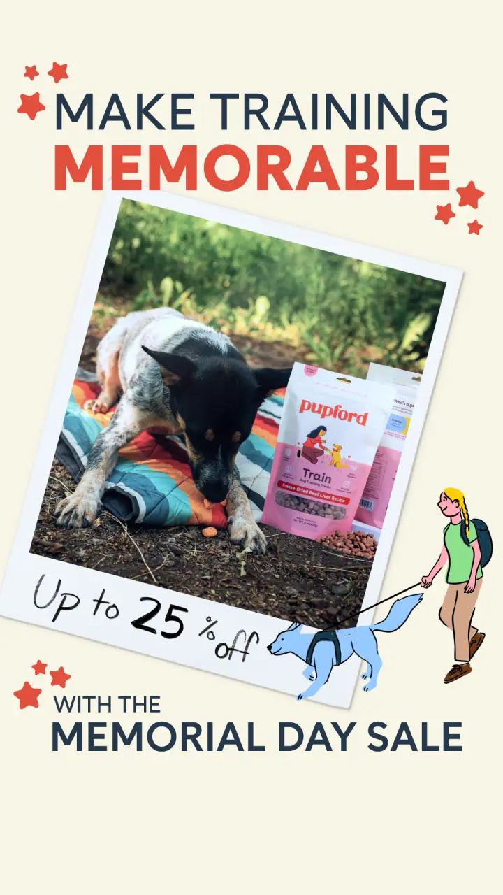
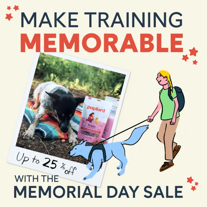
Make training memorablePolaroid & illustration
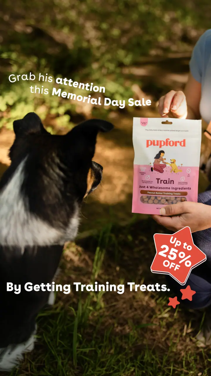
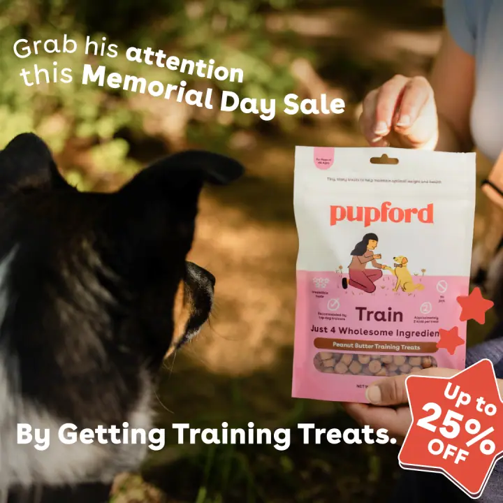
Grab his attentionBorder collie, bag in hand
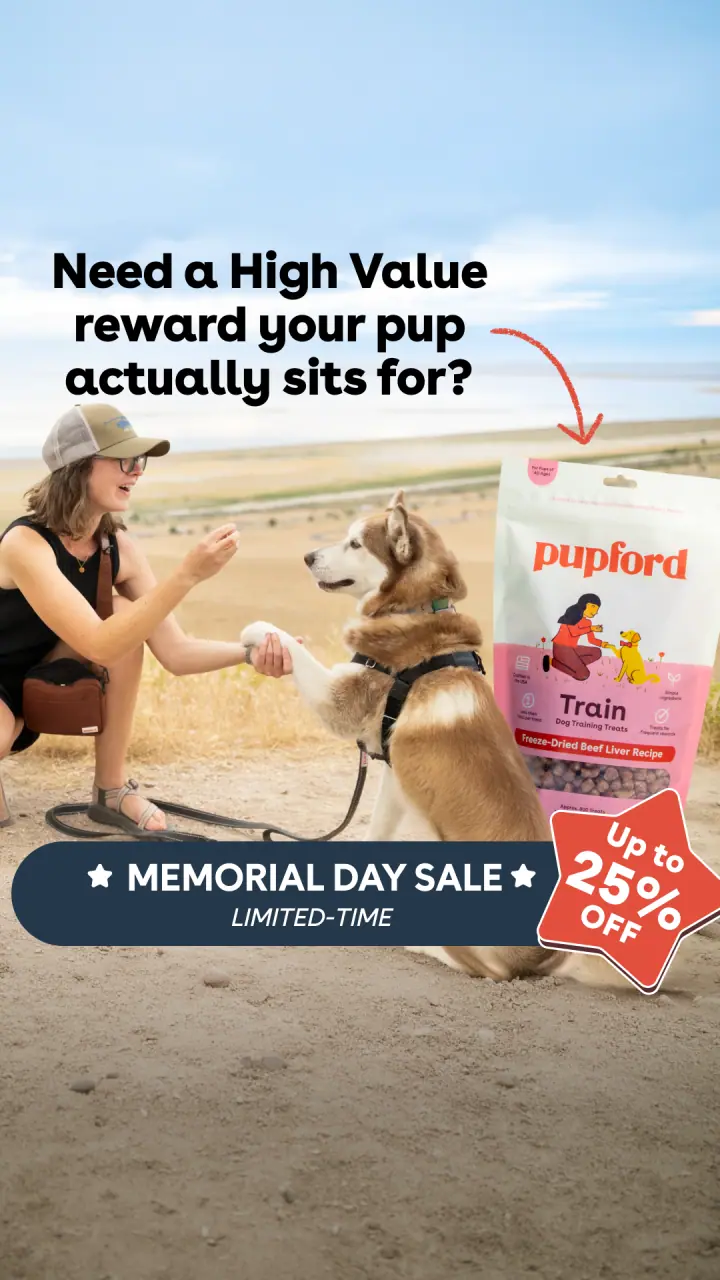
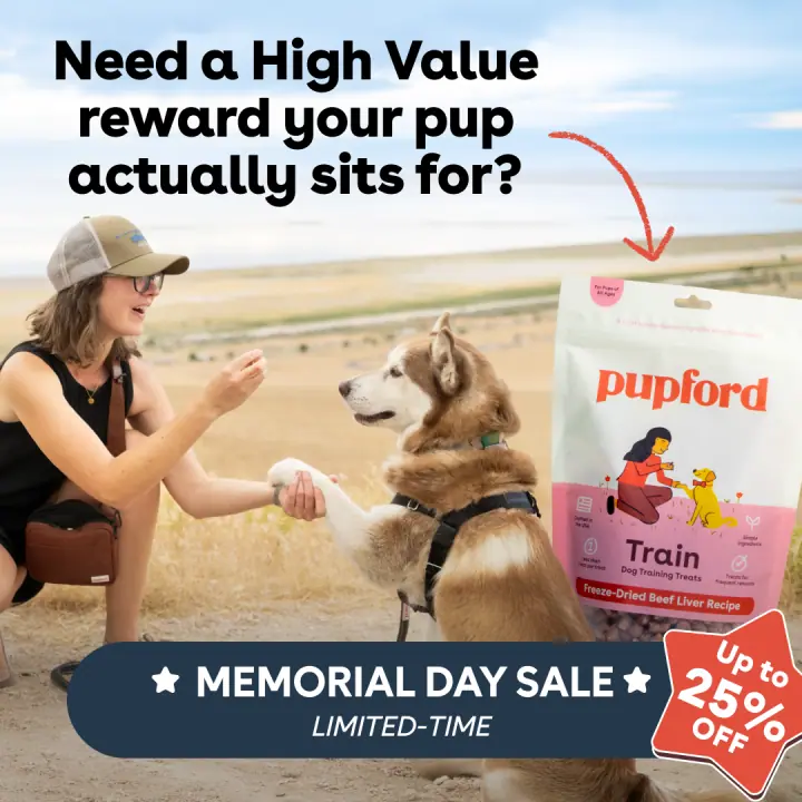
A reward they sit forHusky paw shake
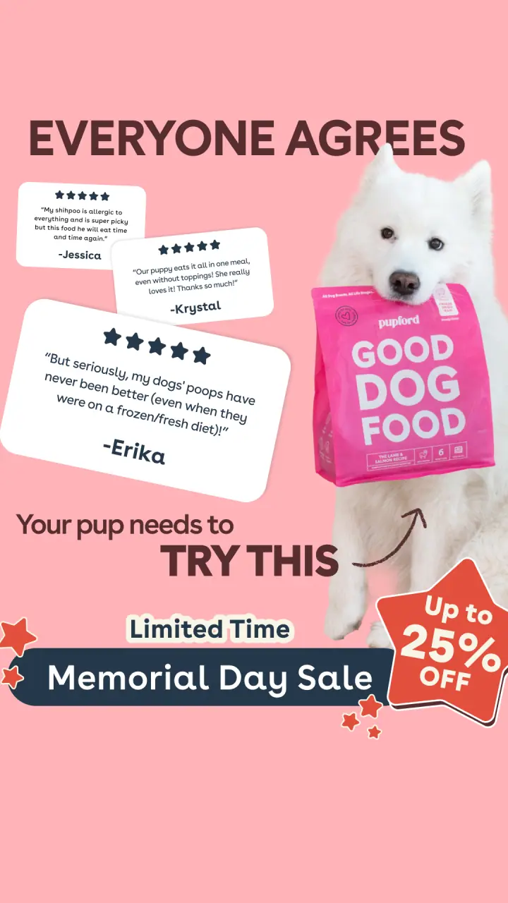
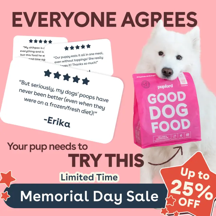
Everyone agreesReview-led, Samoyed
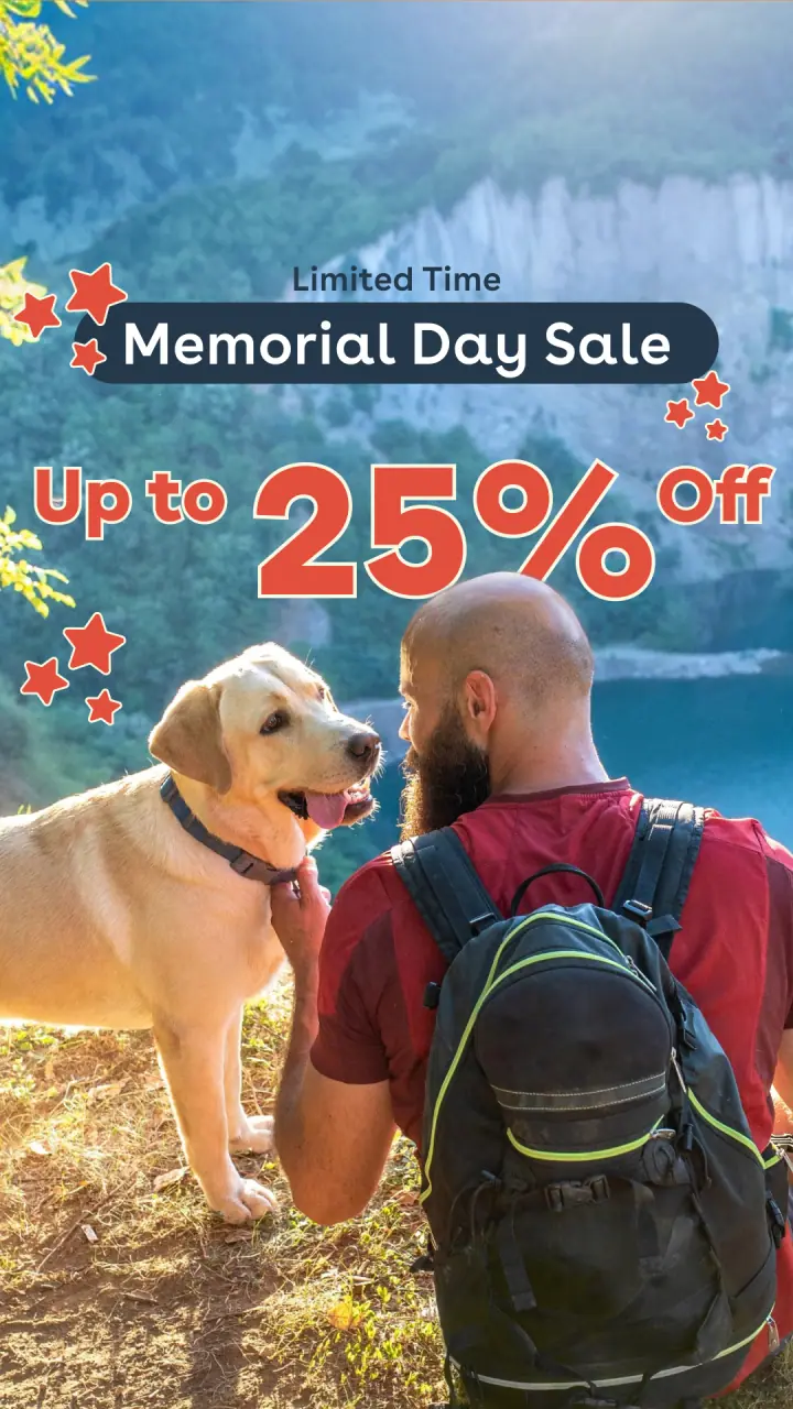
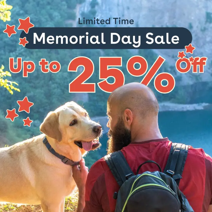
Limited-time bannerHiker & lab
Also in rotation
Single-concept ads
Angle tests that ran on their own
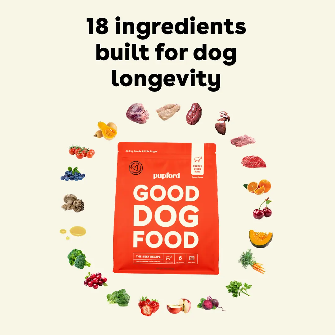
18 ingredients
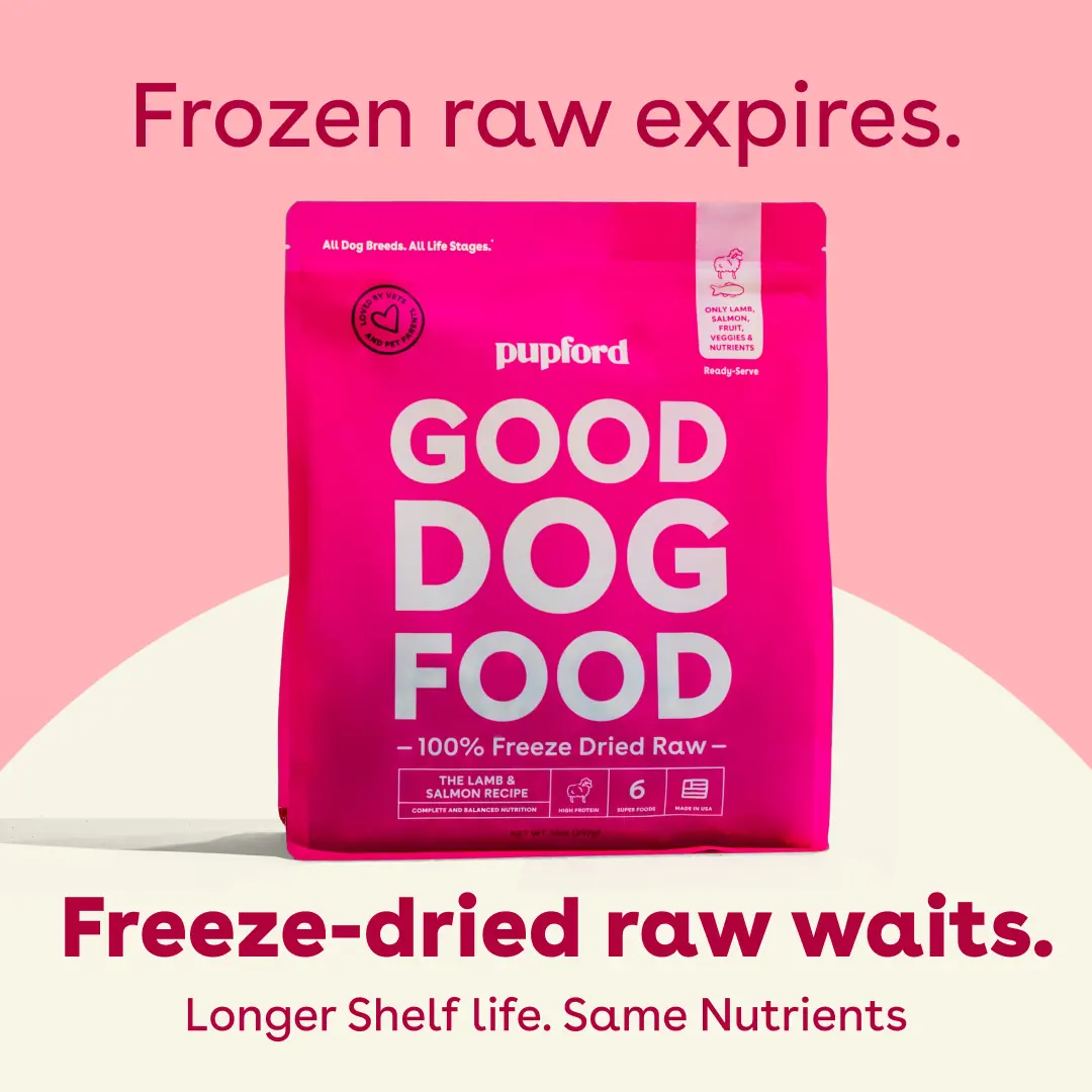
Frozen raw expires
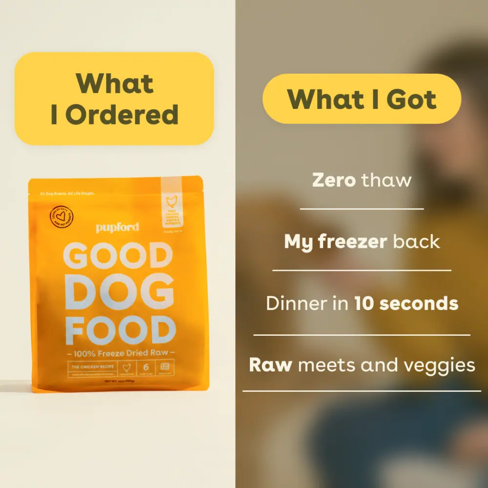
Ordered vs. got
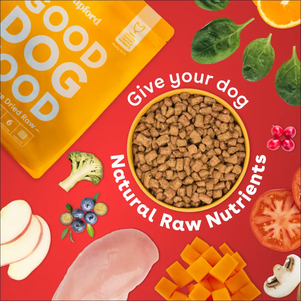
Raw nutrients
Story placements
…and re-cut 9:16 for stories
Same concepts, rebuilt full-bleed / the headline moves,
the crop changes, the argument does not
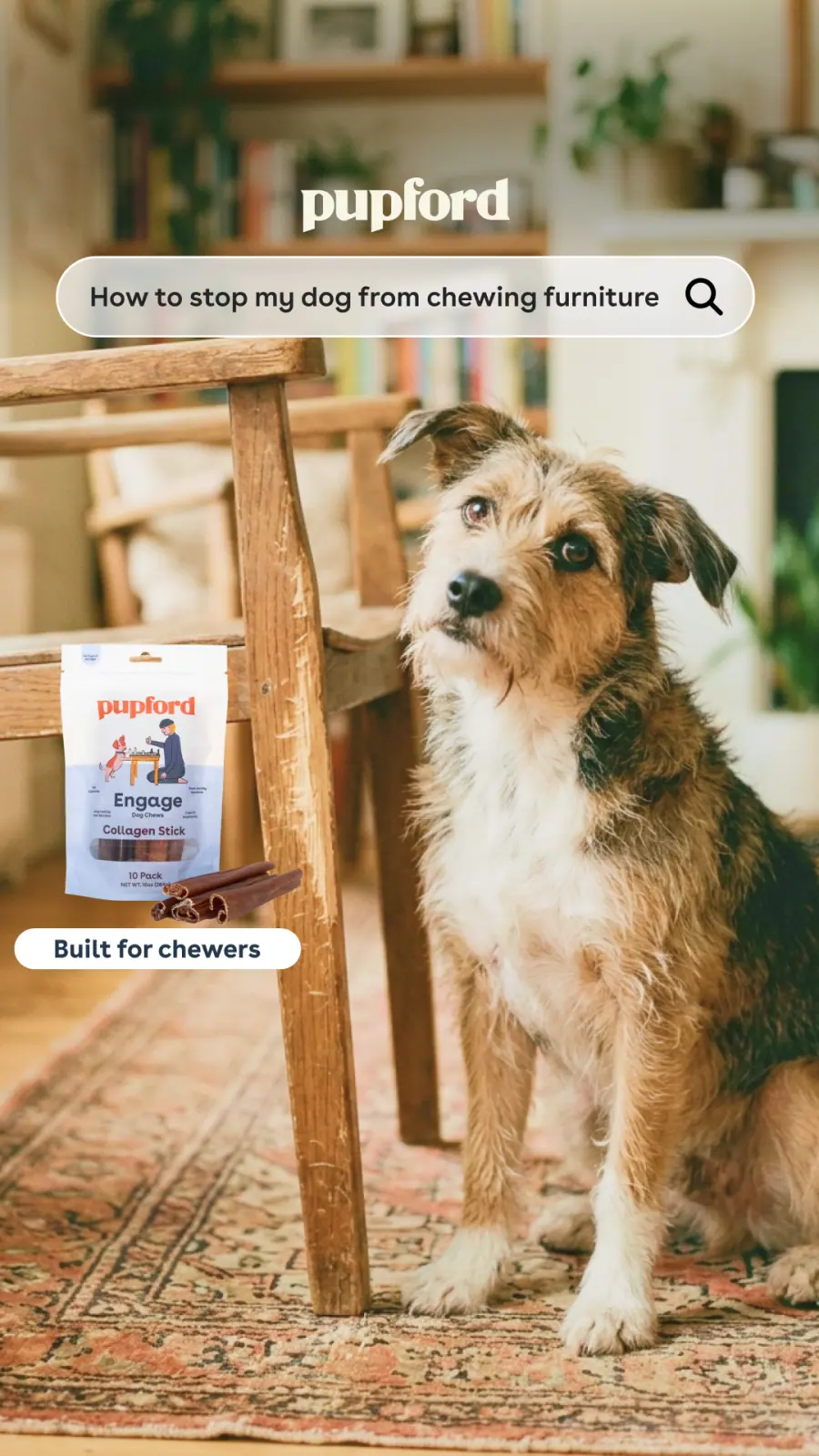
“Built for chewers”
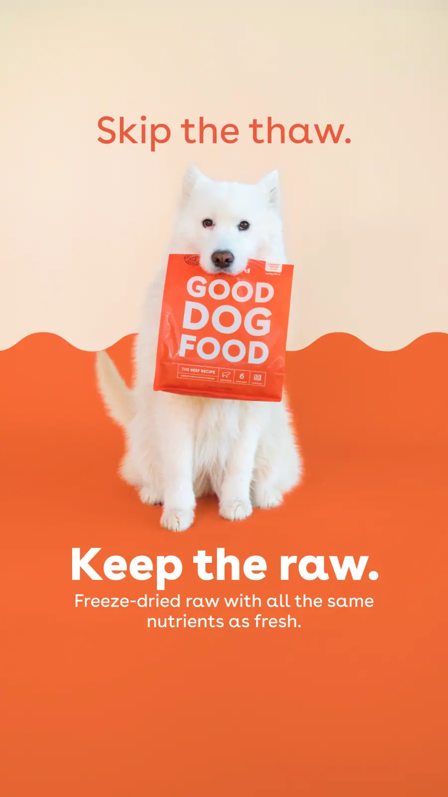
Skip the thaw
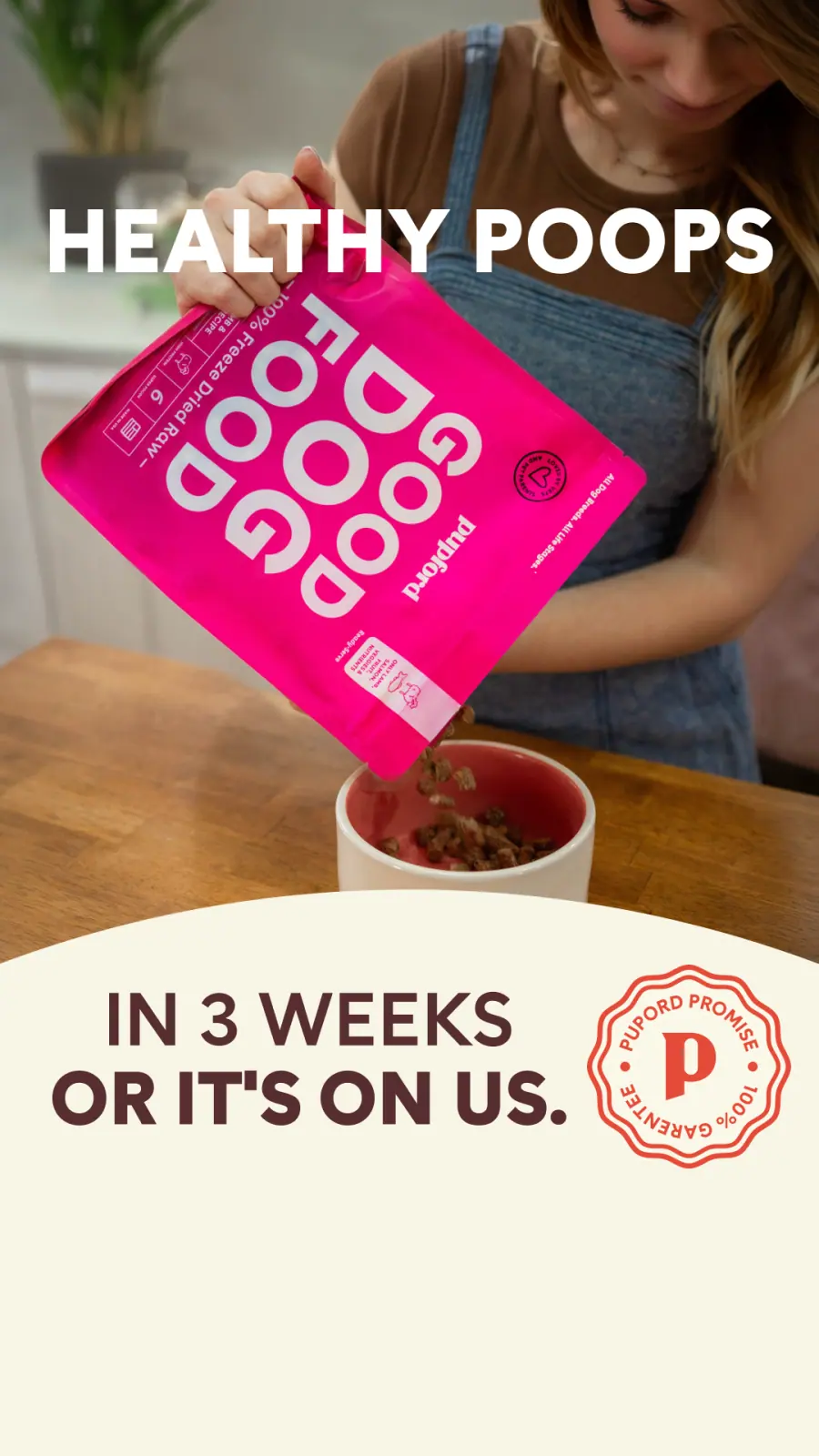
Healthy poops
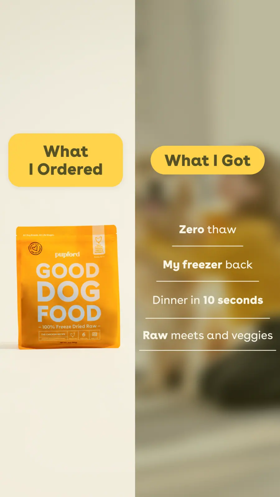
Ordered vs. got
07 — Motion
Made to loop
After Effects / short social cuts, silent,
built so the last frame runs back into the first
A new-year list post animated as a hard-cut loop — short enough that the feed replays it before the reader has finished reading.
A spin-the-wheel loop that turns the pause button into the mechanic — wherever the viewer stops it, that’s the trick they train next.
08 — Carousels
The format that does the teaching
Instagram carousels / drag or use the arrows to page through each post
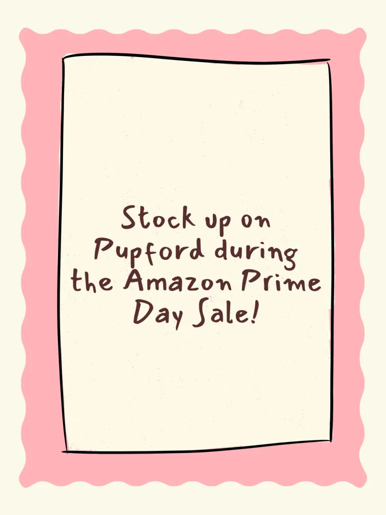
Prime Day · 12 slides
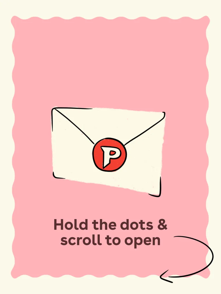
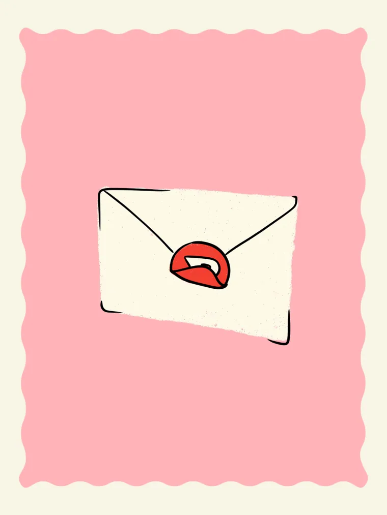
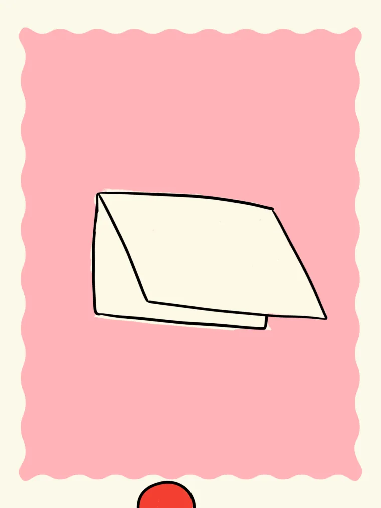
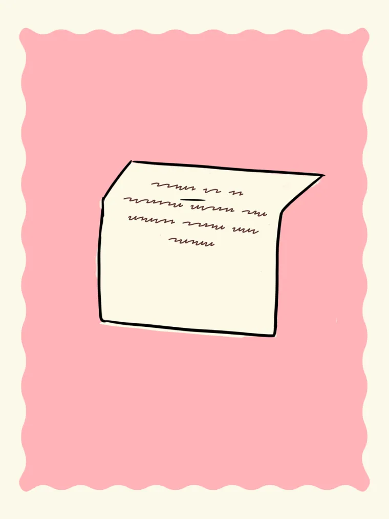
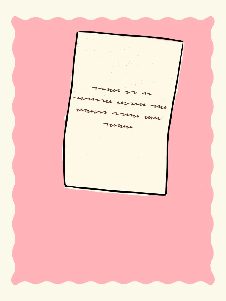
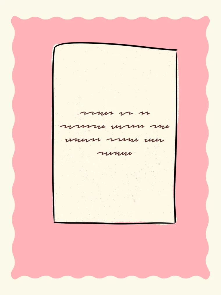
Swipe for a secret message
Twelve hand-drawn frames that turn the swipe itself into the mechanic — the envelope unseals, the letter unfolds, and the offer is the payoff. Played back here at posting speed.
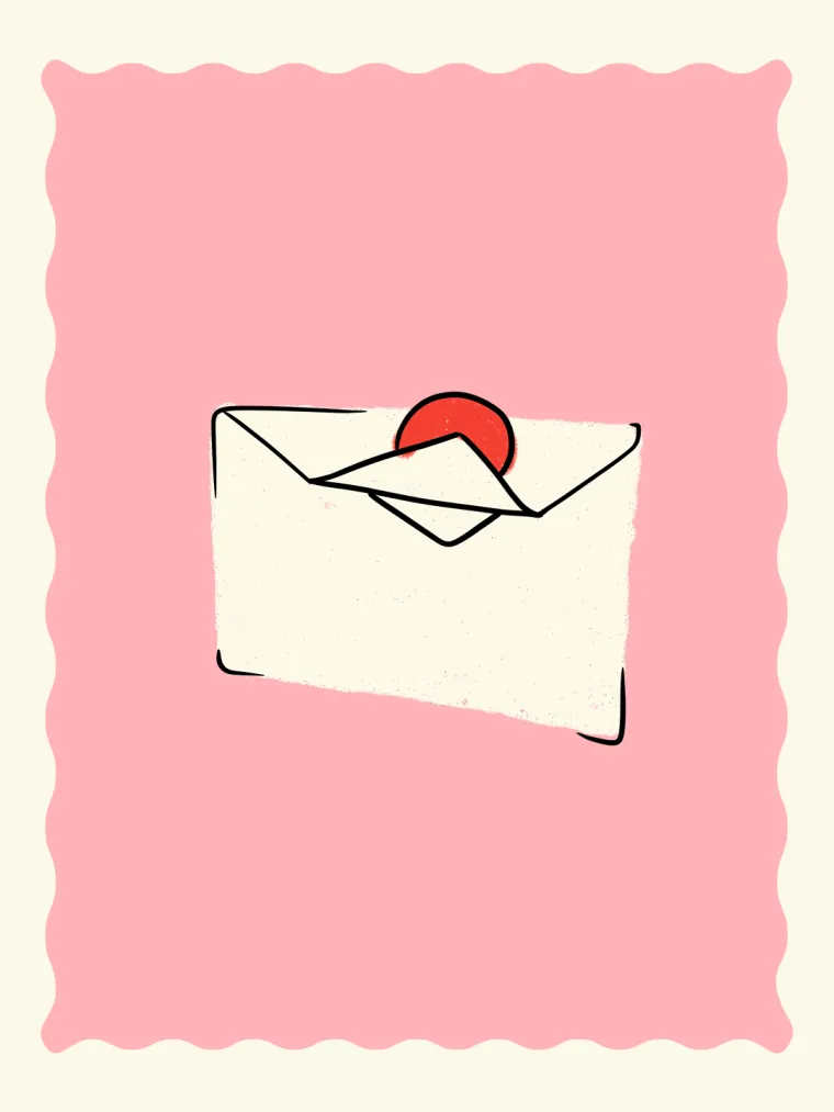
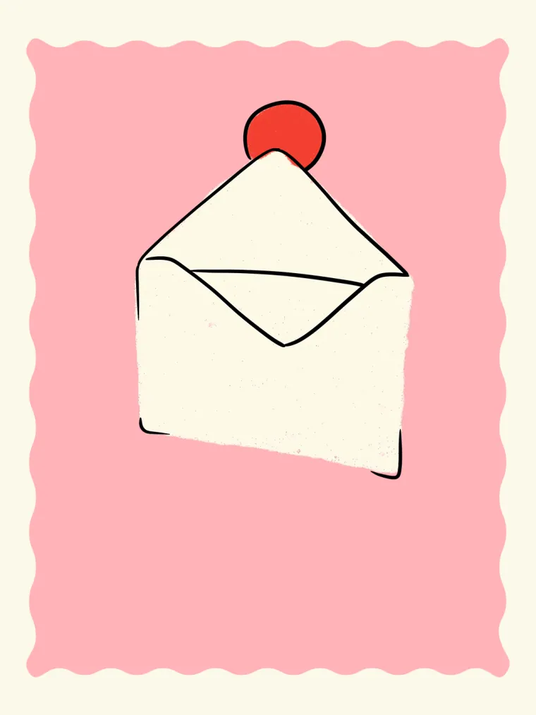

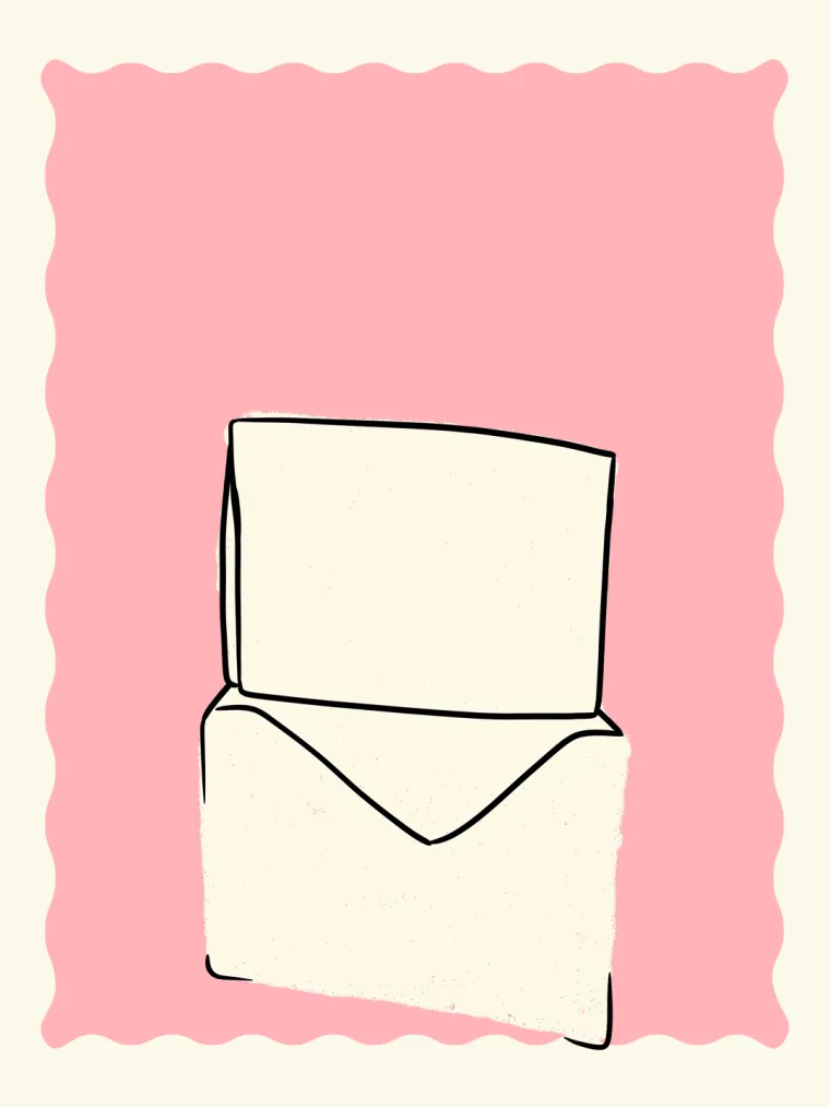
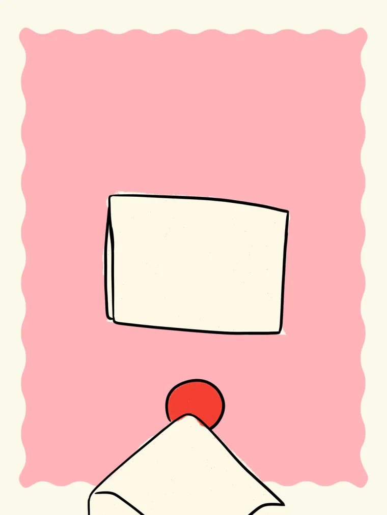
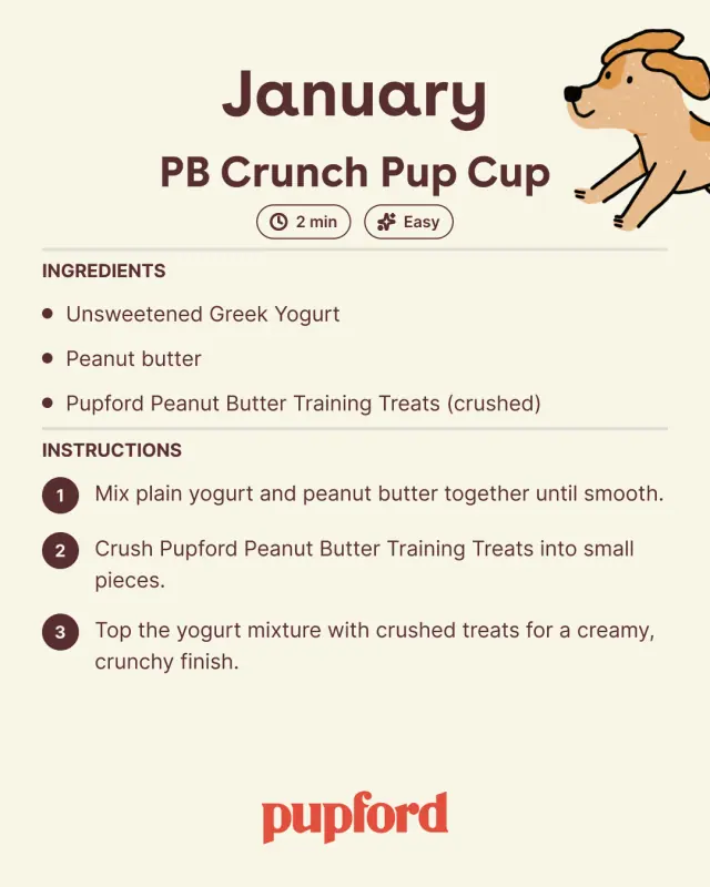
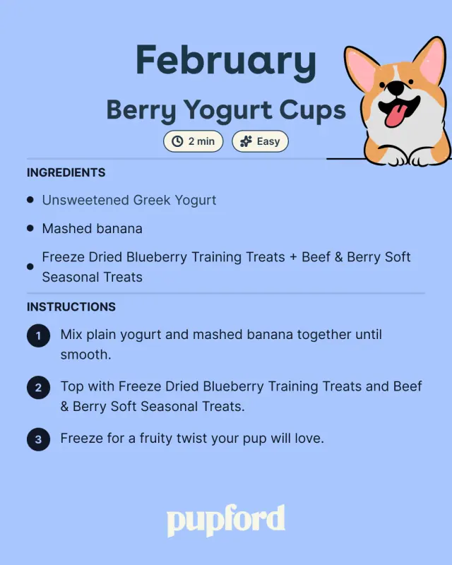
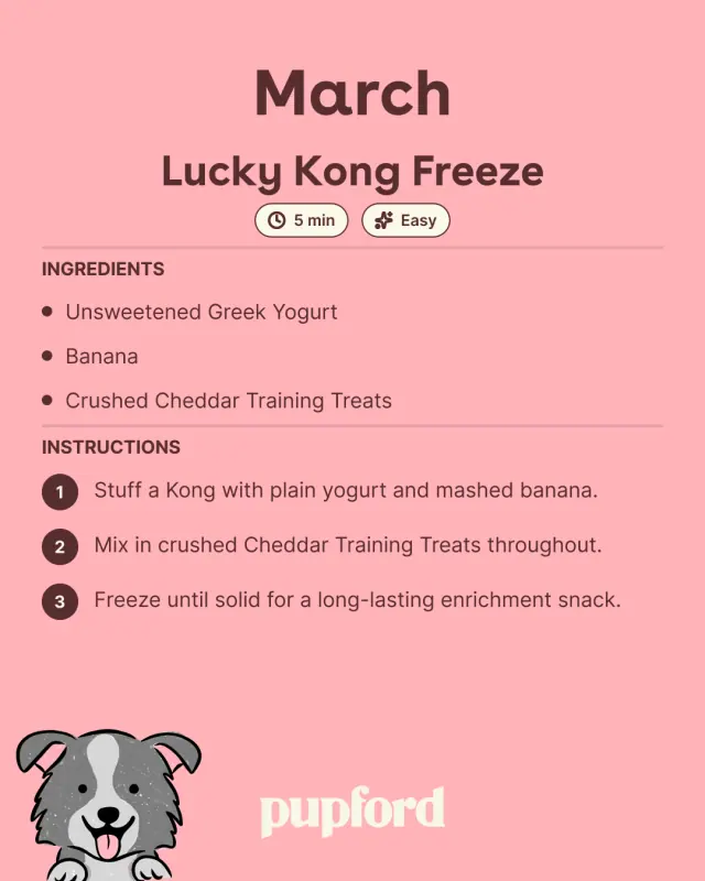
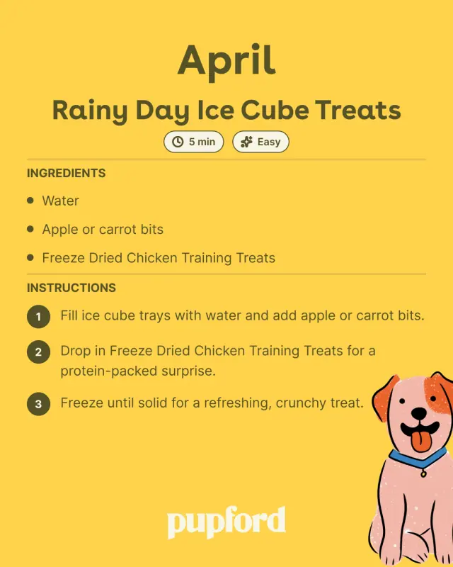
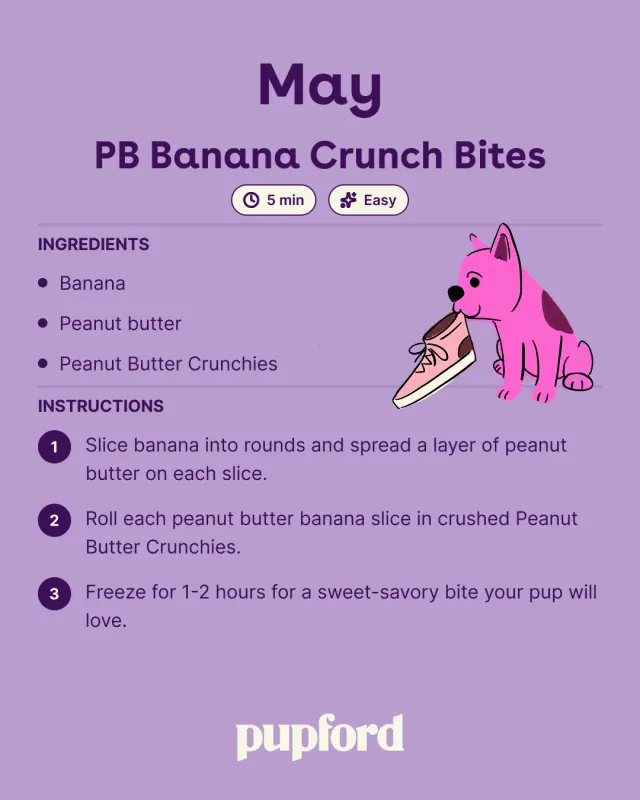
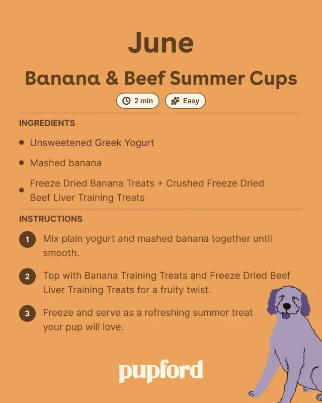
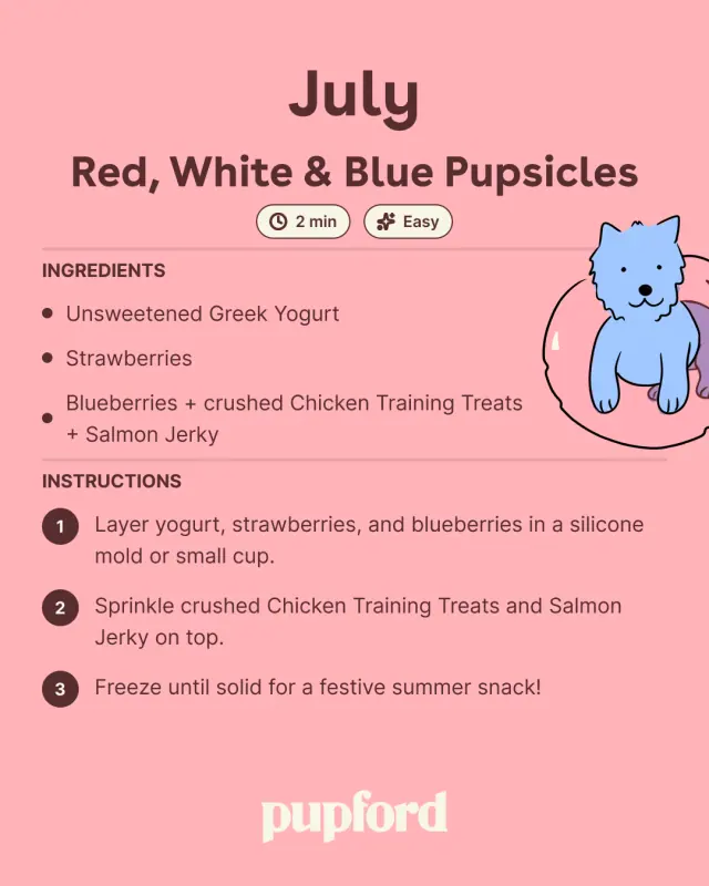
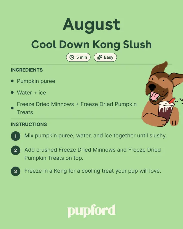
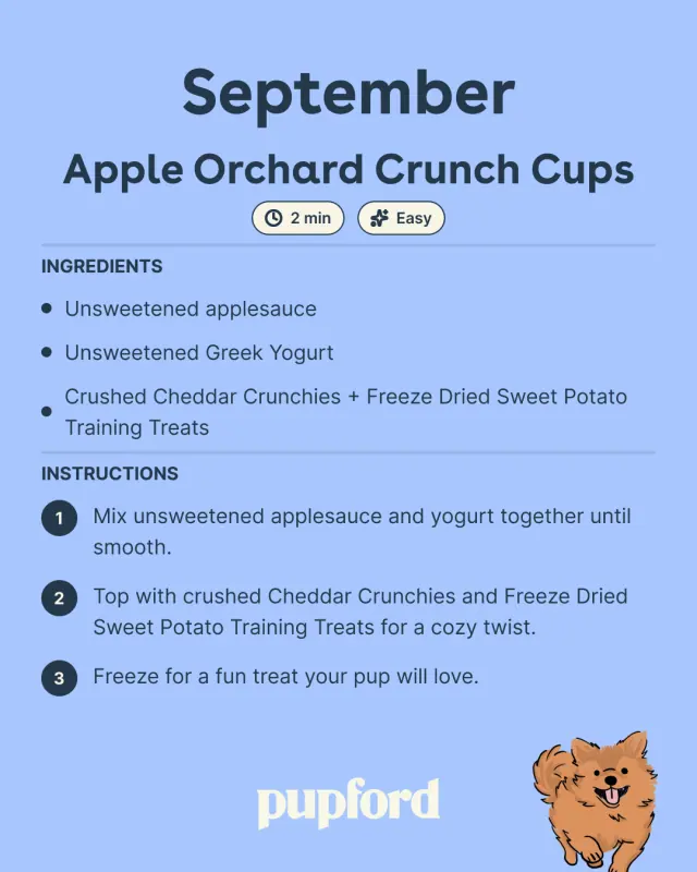
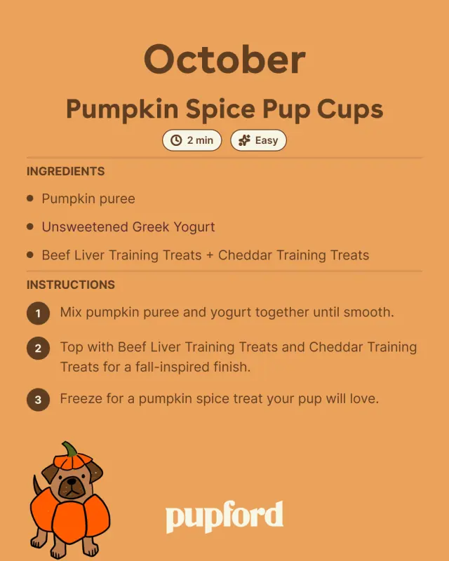
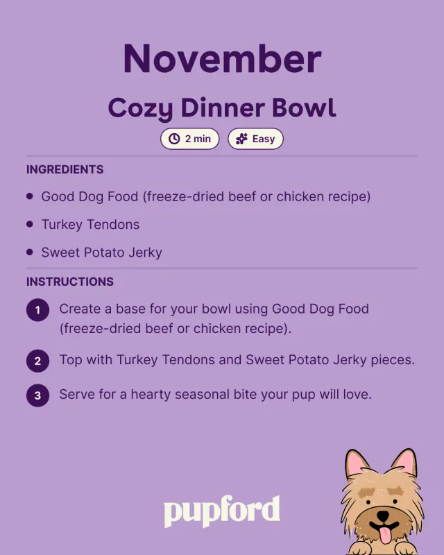
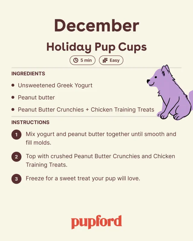
Recipe series · 12 slides
Twelve months of treat recipes
One template, twelve colourways — a seasonal recipe a month, each carrying its own line-segment colour and its own drawn pup.
 01
01
 02
02
 03
03
 04
04
 05
05
 06
06
 07
07
 08
08
 09
09
 10
10
 11
11
 12
12
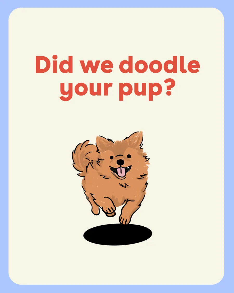
Community series · 13 slides
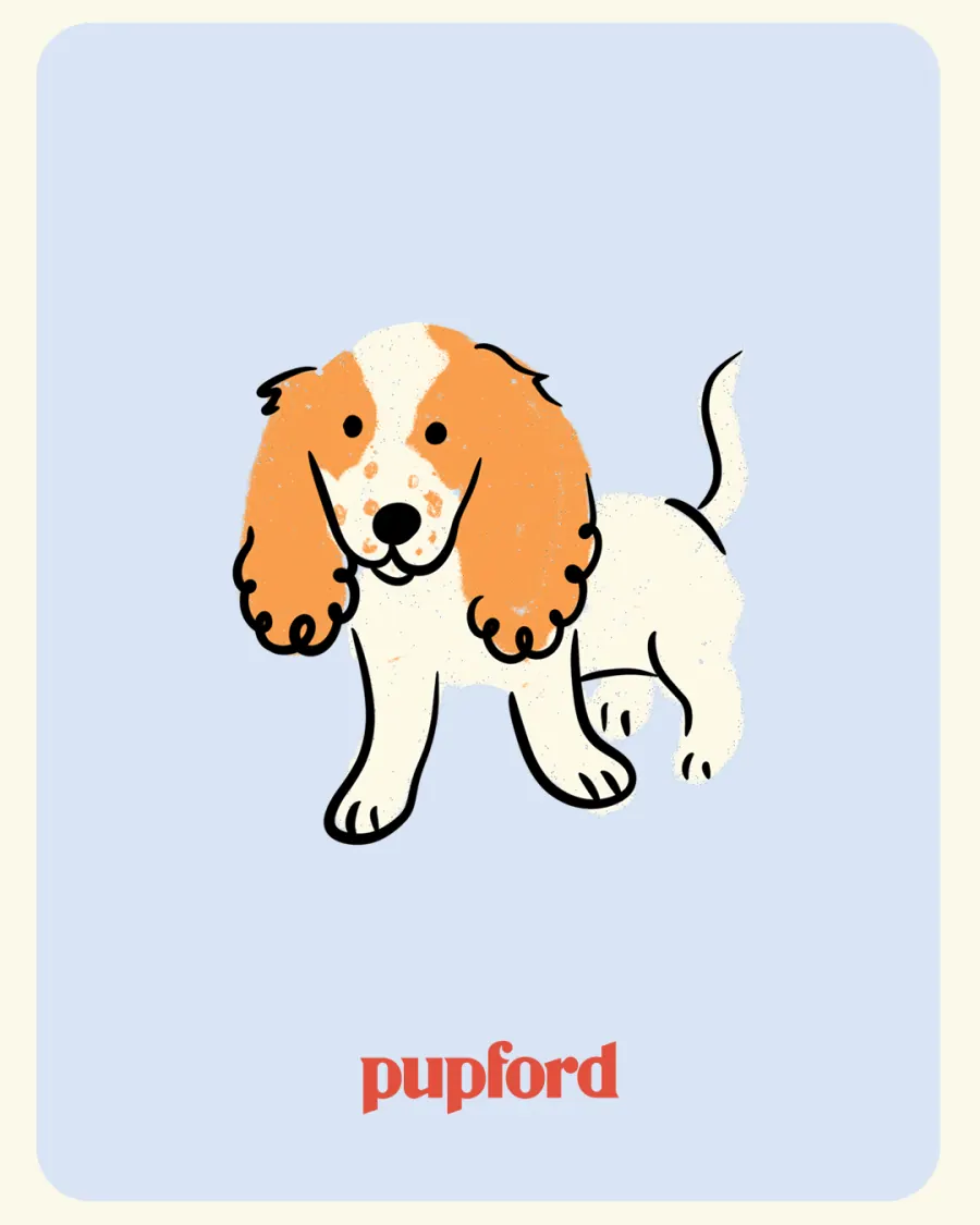
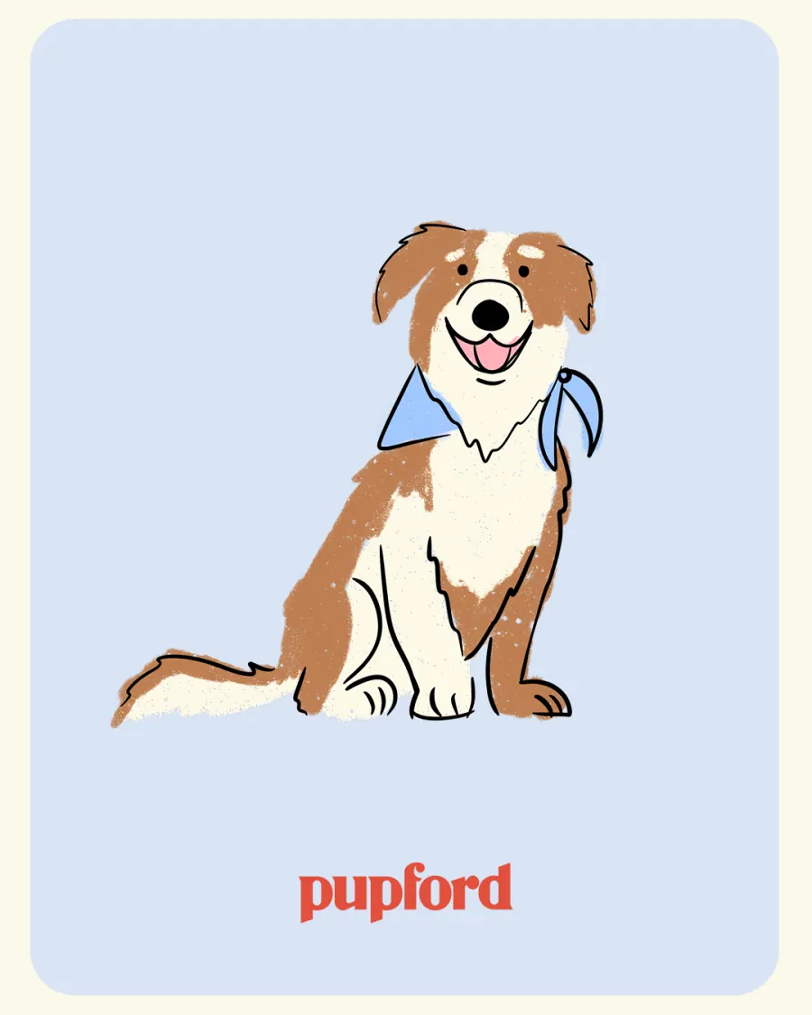
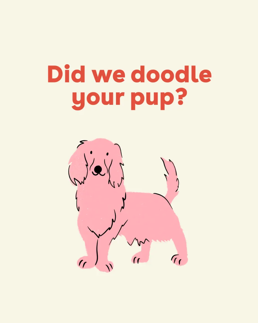
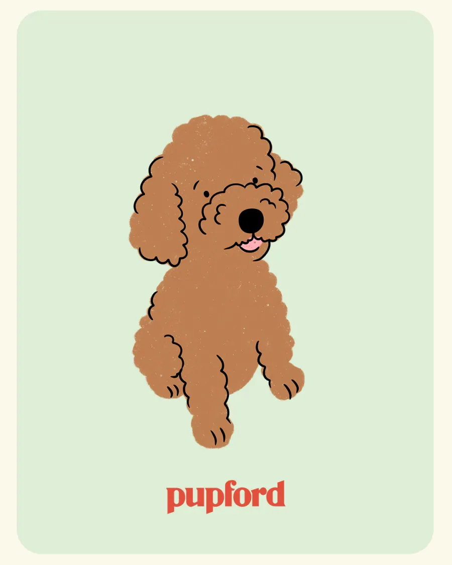
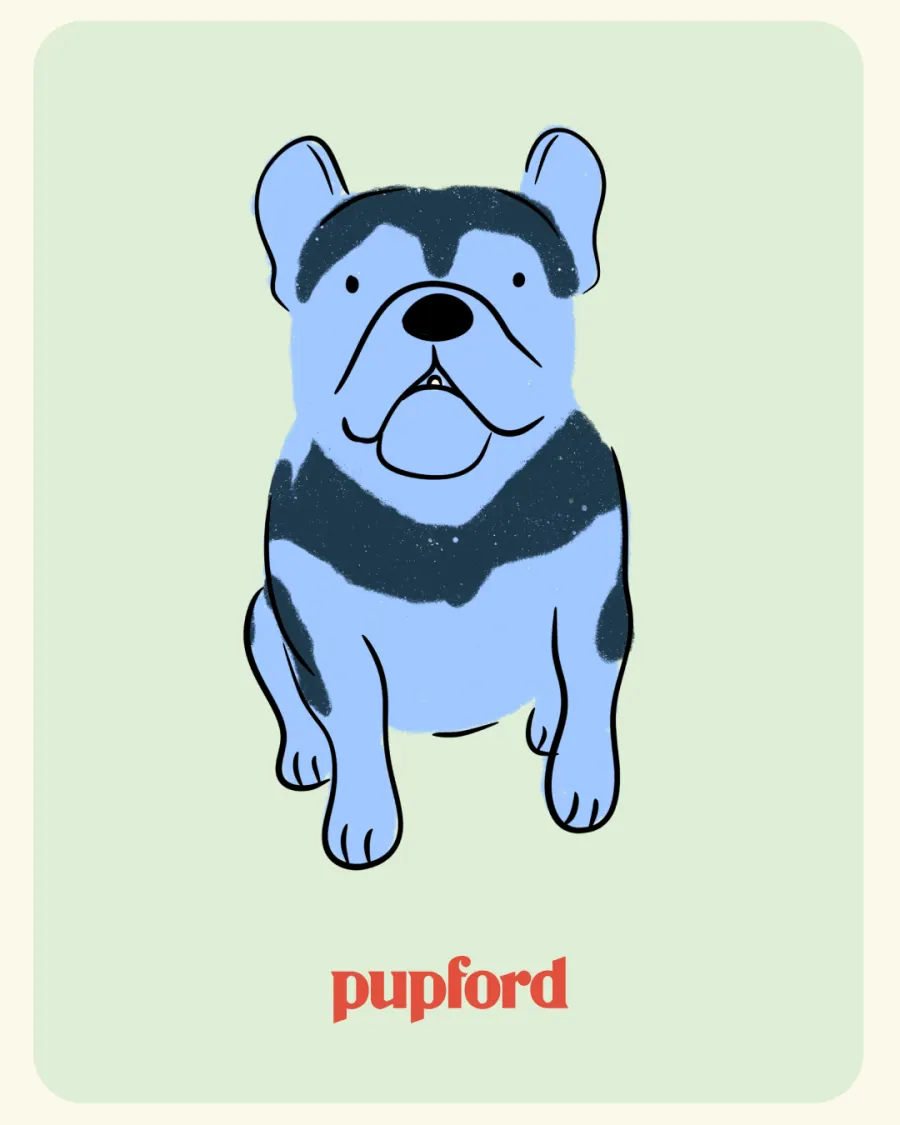
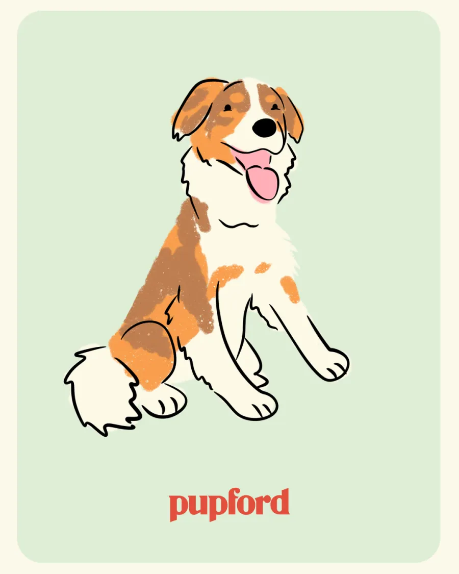
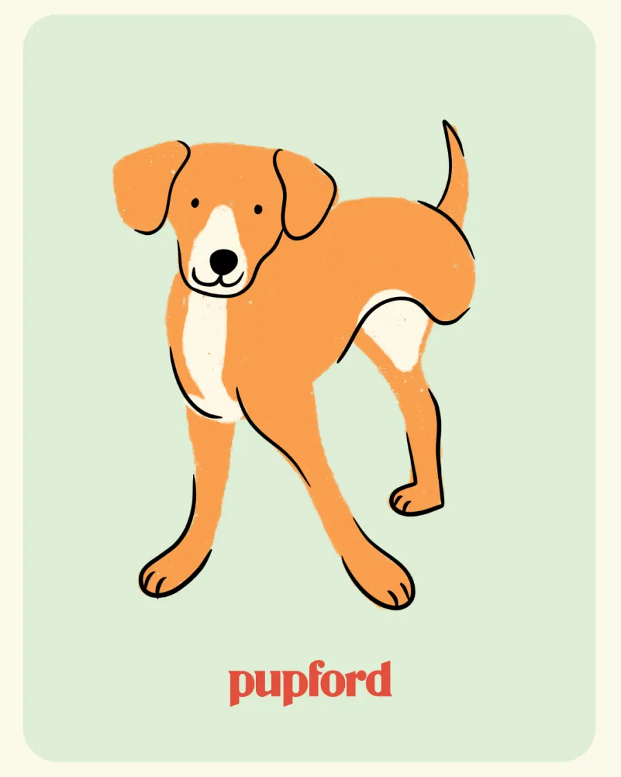
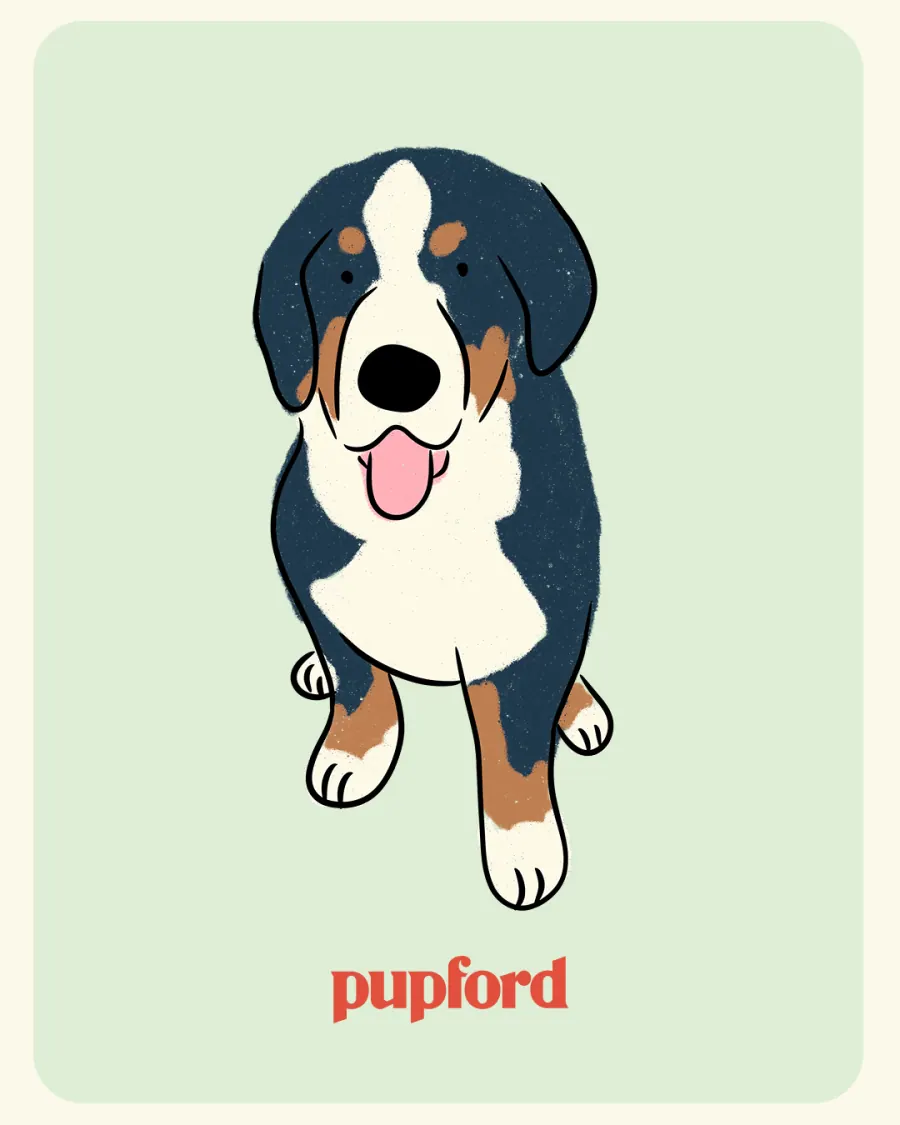
Did we draw your dog?
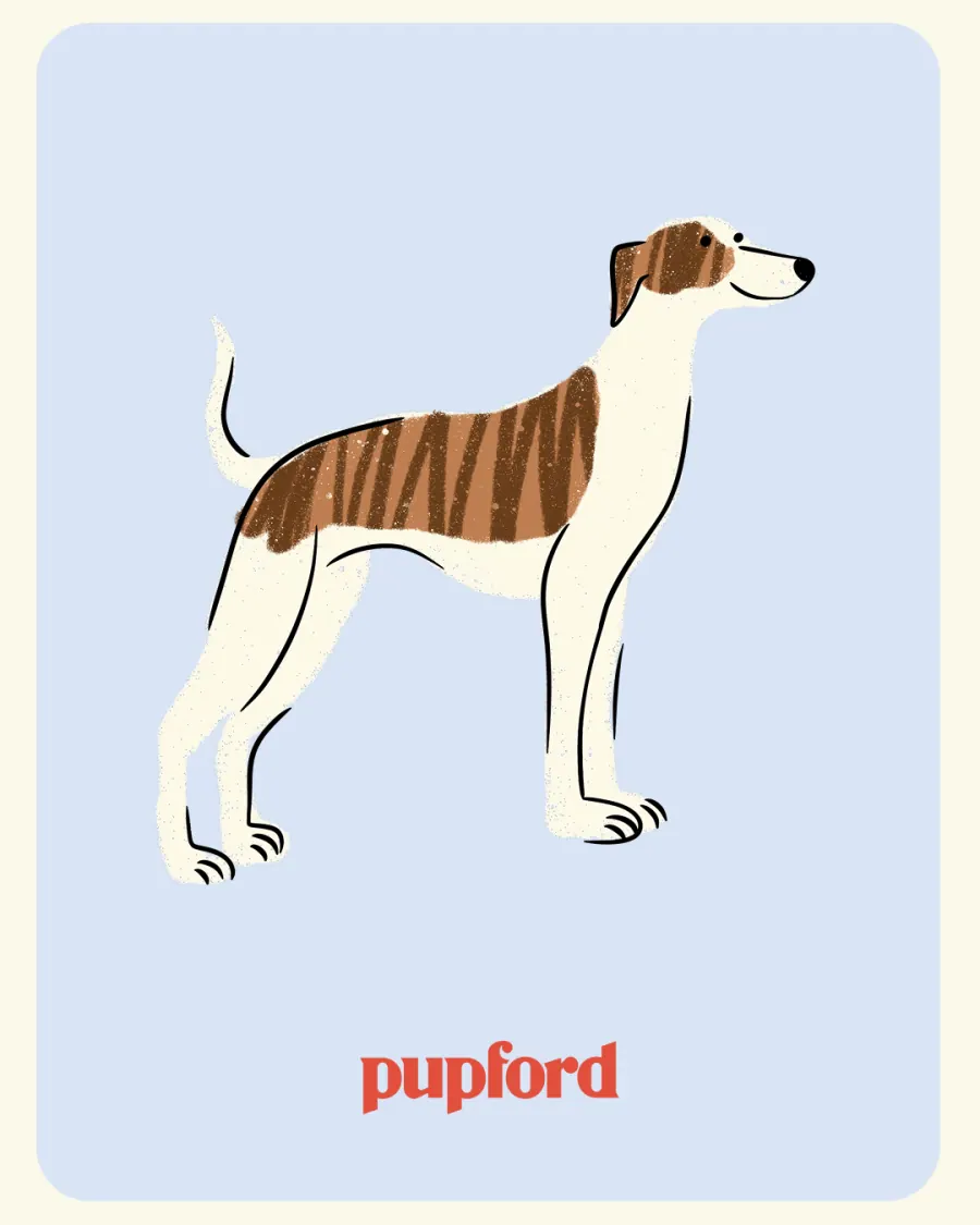
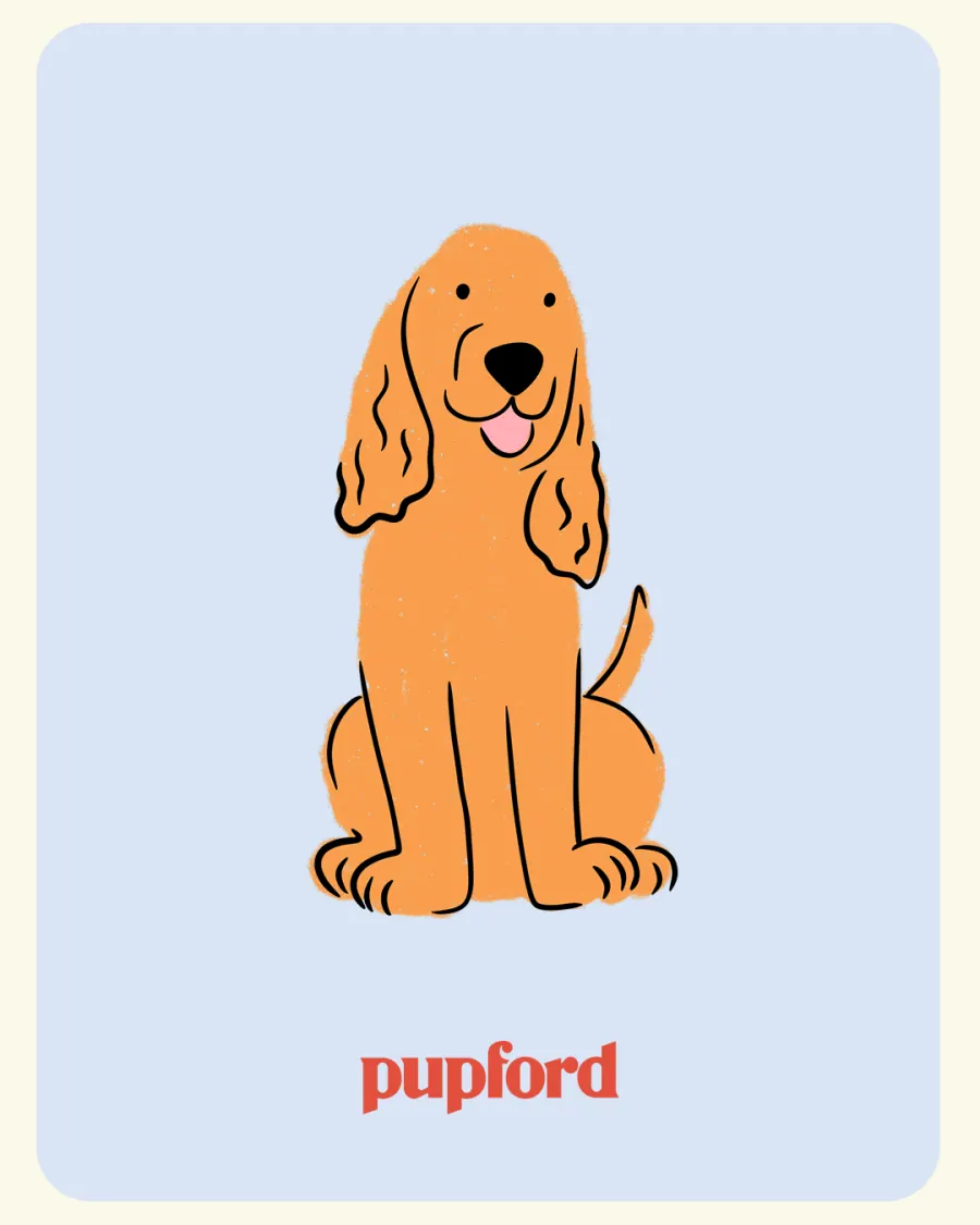
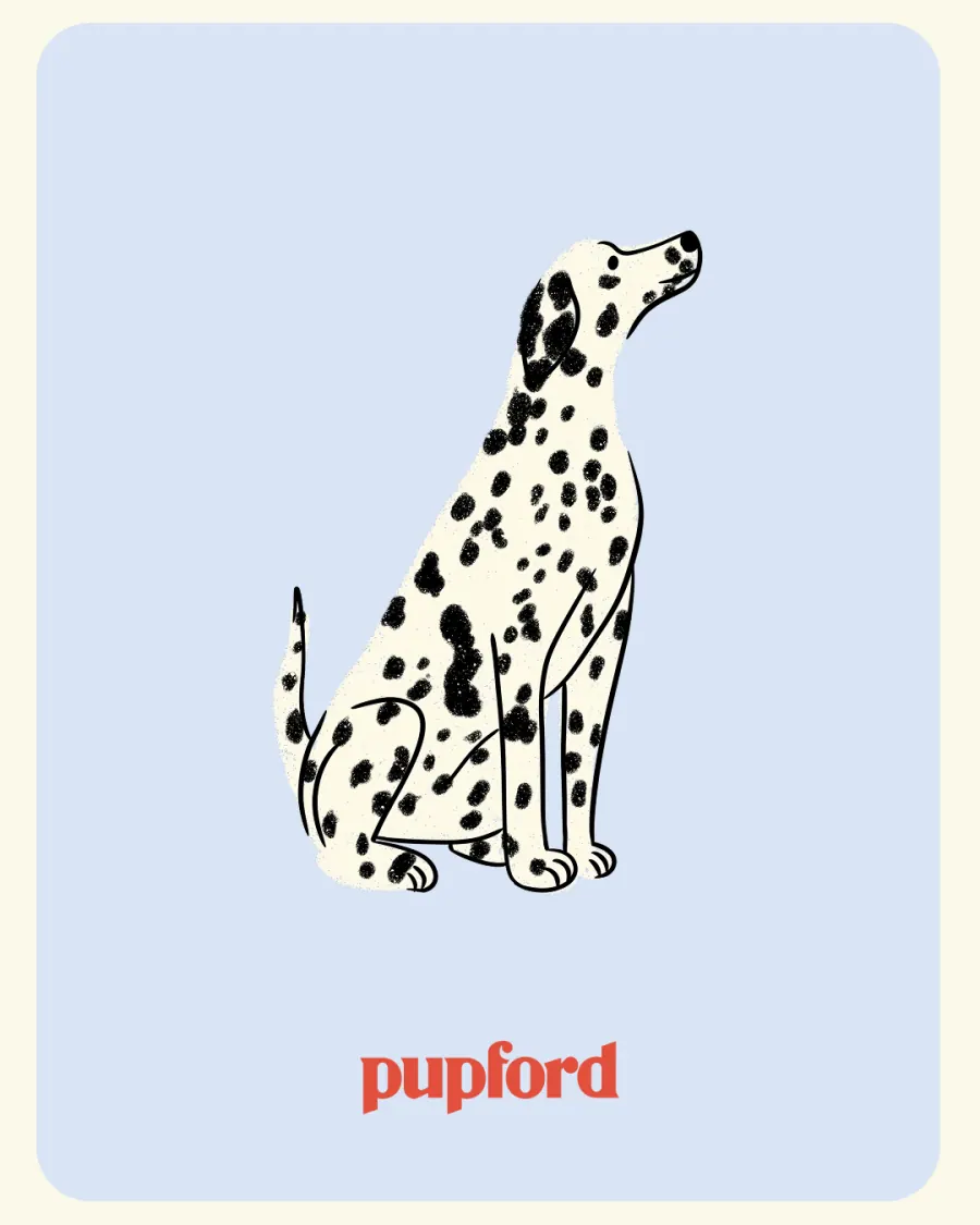
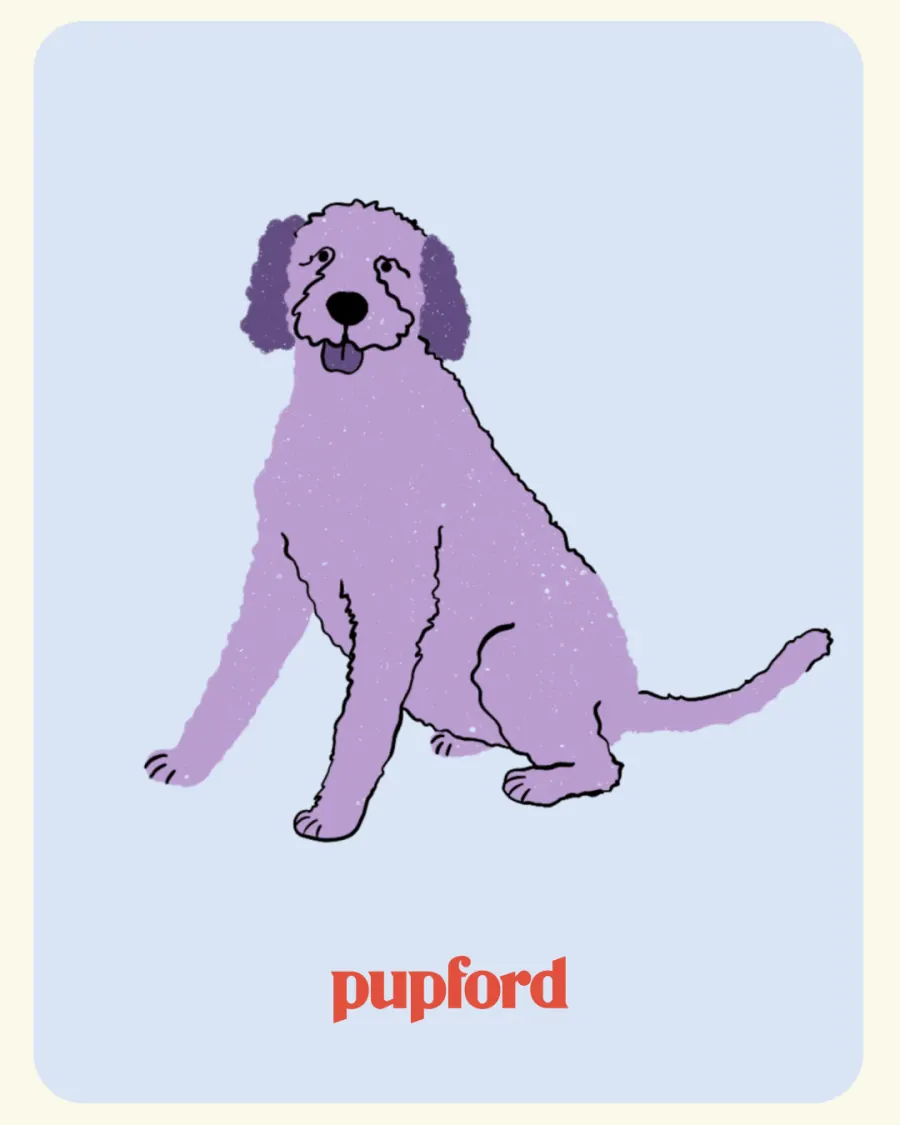
Followers send a photo, the pup comes back hand-drawn. The cheapest engagement mechanic on the calendar, and the one that put the illustration system in front of the most people.
 01
01
 02
02
 03
03
 04
04
 05
05
 06
06
 07
07
 08
08
 09
09
 10
10
 11
11
 12
12
 13
13
Education · 4 slides
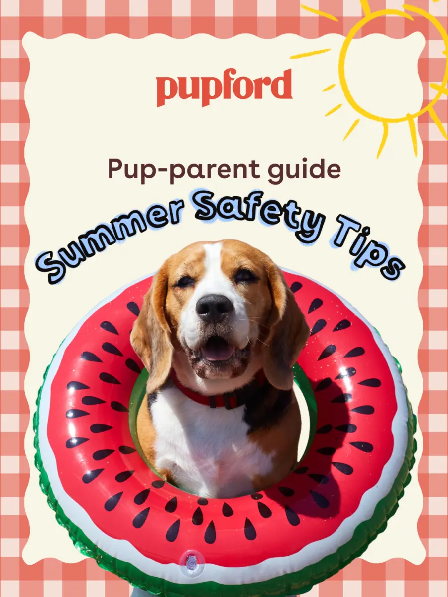
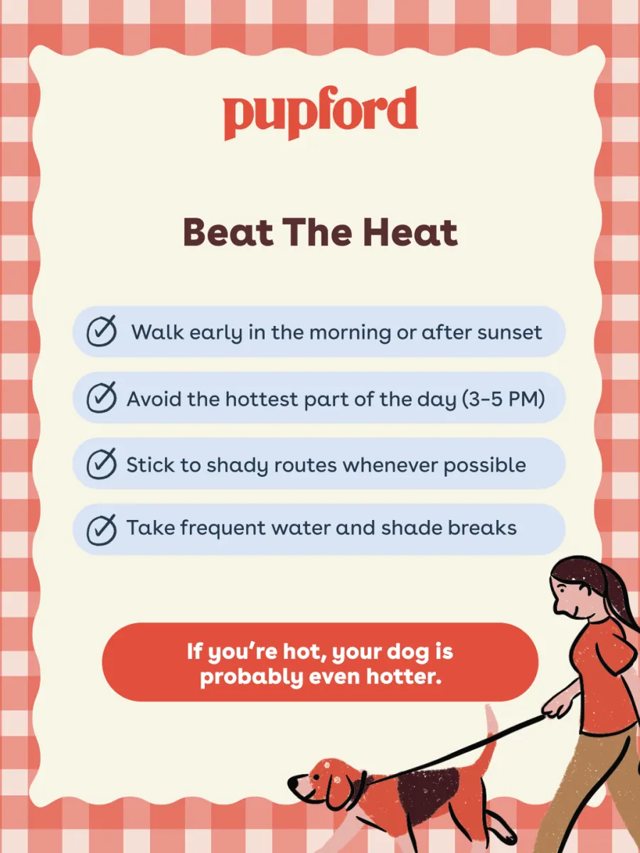
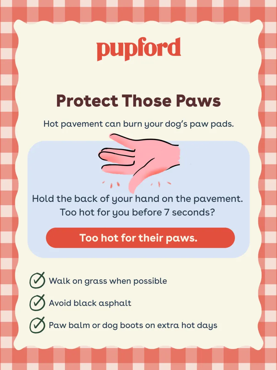
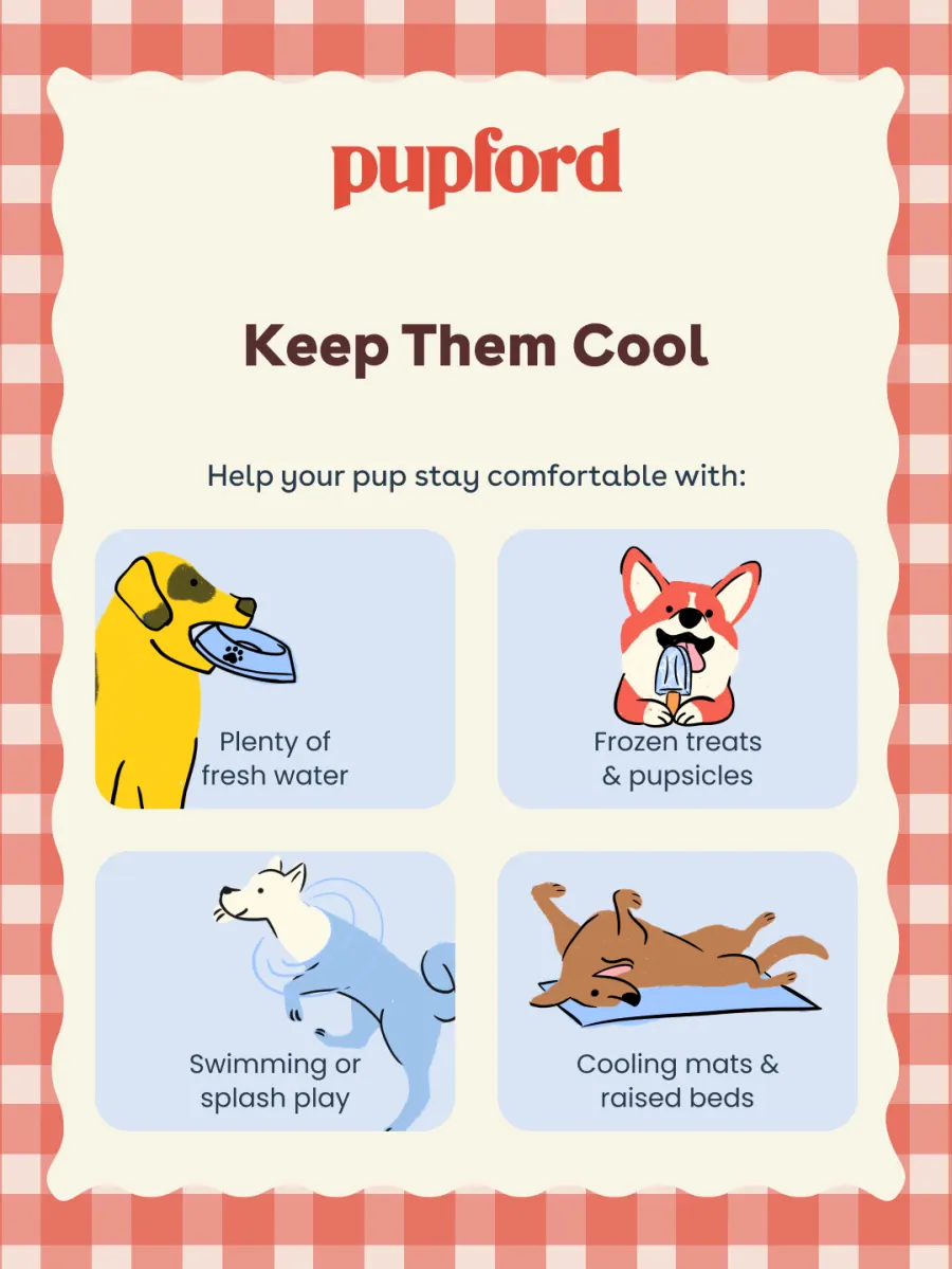
Summer safety tips
A pup-parent guide that earns its place in the feed before it asks for anything. Gingham frame, drawn icons, no product until the last card.
 01
01
 02
02
 03
03
 04
04
Education · 5 slides
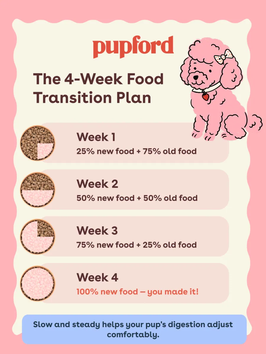
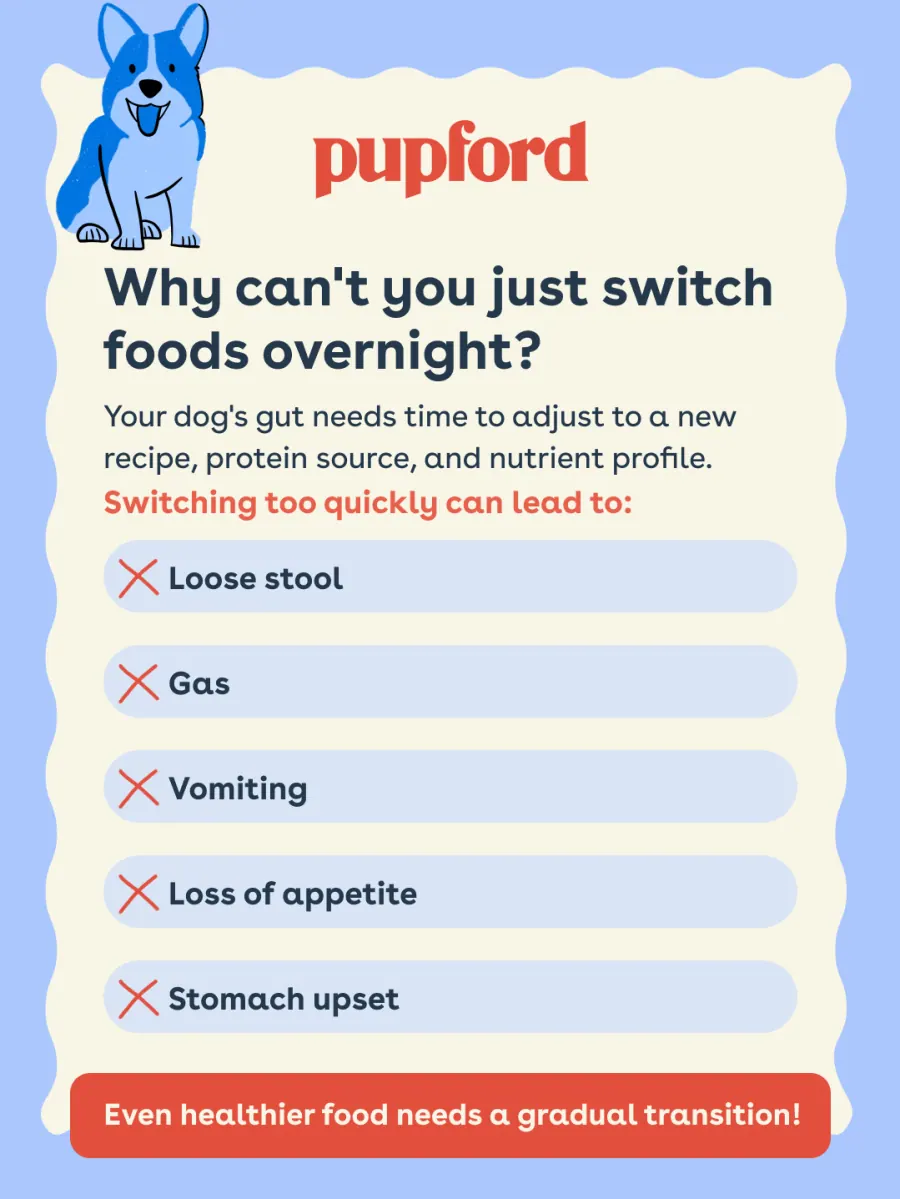
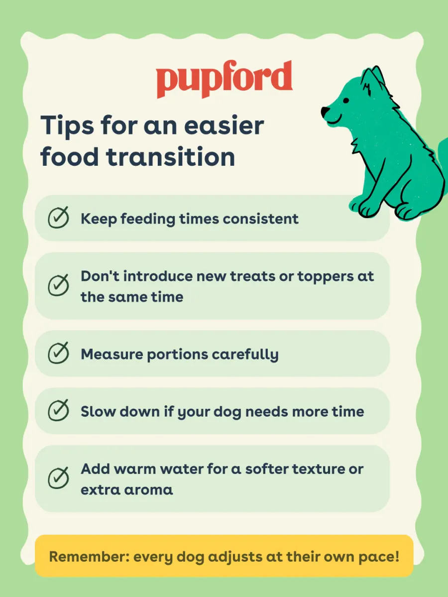
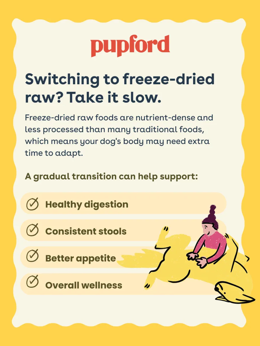
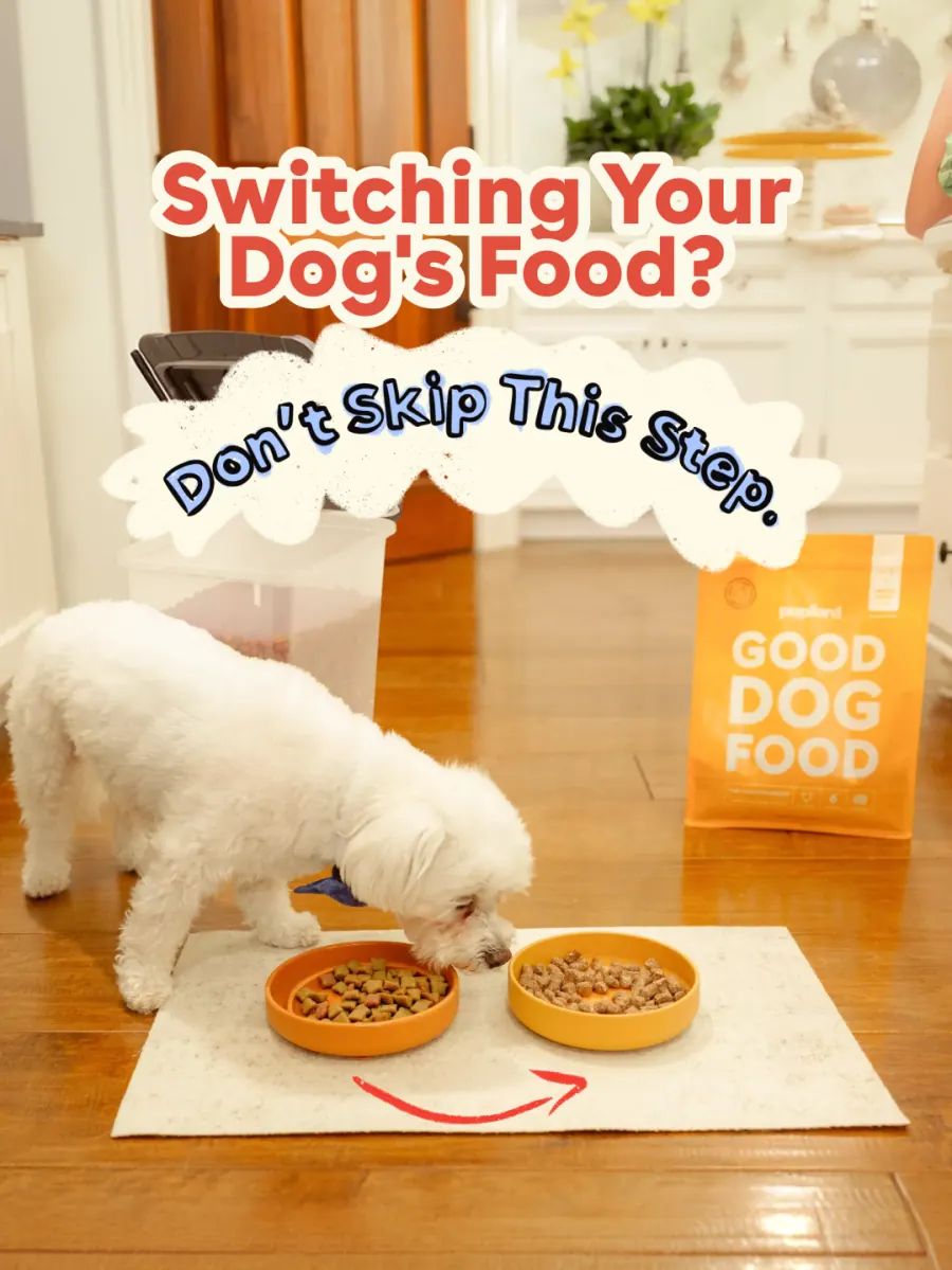
The four-week food transition plan
The most-asked support question, answered as a carousel and reused as a blog header, an email and an ad angle.
 01
01
 02
02
 03
03
 04
04
 05
05
Next project
Action Target