
Brand identity / Packaging, menus, storefront
Hollis Brewery
An identity for a craft brewery, carried from the bottle label to the folded menu to the sign over the door.
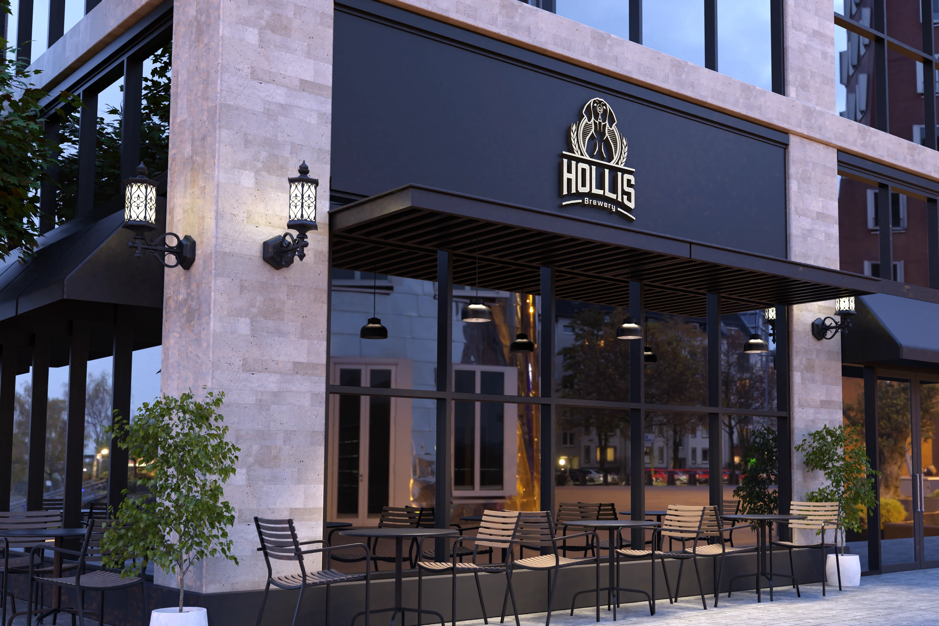
Storefront
The crest on the sign, lit for the evening crowdExterior signage · shown in place
Hollis Brewery needed an identity that felt established from day one. The crest sits at the centre of everything: bold enough to read as a lit sign at street level, simple enough to print small on a bottle neck.
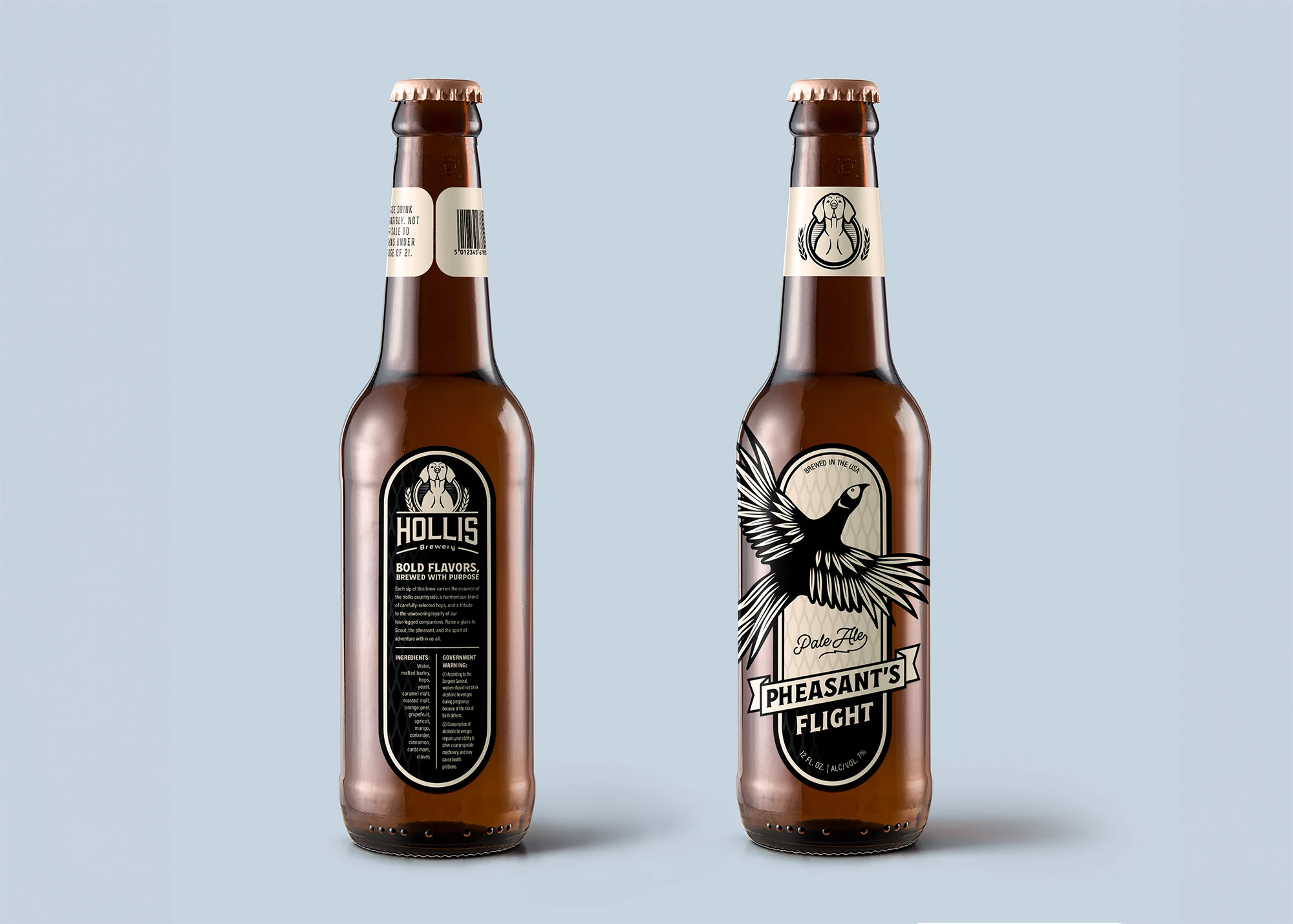

The label series gives each beer its own illustration, like the pheasant on Pheasant’s Flight, inside a shared frame so the line-up looks like a family on the shelf. The menu uses the same black-and-cream pairing, folded so the crest lands on the front panel.

Everything was designed to survive cheap printing and dim light: high contrast, few colours, and type sizes that hold up on a bar top.
- 01
Identity
Crest, wordmark and lockups.
- 02
Packaging
Bottle labels with a per-beer illustration inside a shared frame.
- 03
Menus
Folded menu, front and back, in the same black and cream.
- 04
Environment
Storefront signage.
Next project
Mafia Cards